
2025 Ligature Best in Show Junior Award Winner
THE ASK:
Create an infographic poster showcasing a food culture to be placed on the wall of a middle school.
THE ANSWER:
An infographic showcasing recipes that primarily feature native Florida plants, intended to cultivate an interest for Florida's nature. The infographic employs an illustration style modeled on linocut prints, mirroring the hands-on experience of foraging for native plants as well as appealing to a younger audience. A clear textual hierarchy keeps the infographic from becoming confusing or cluttered despite its messy style.
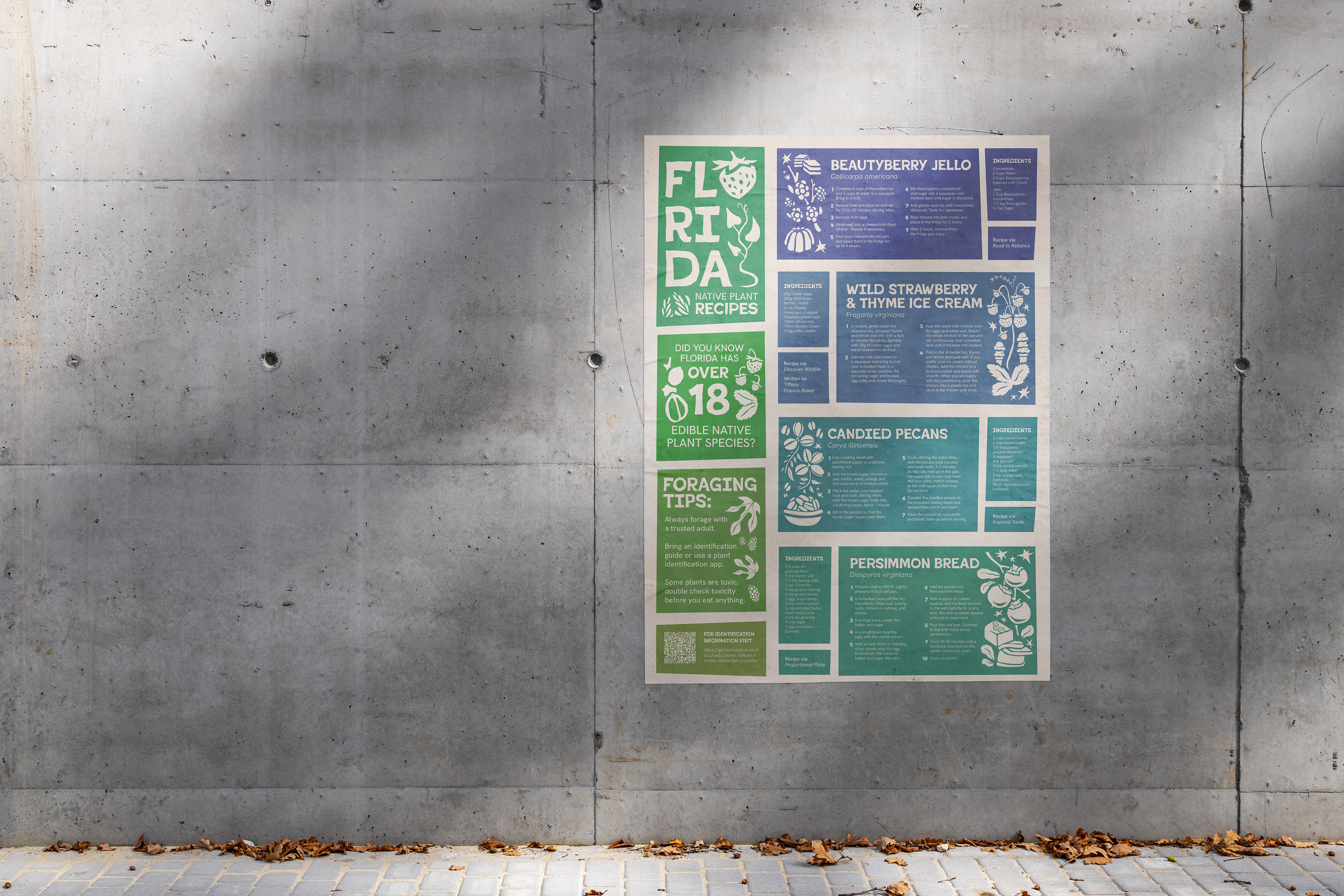
Mockup of the infographic as a poster.
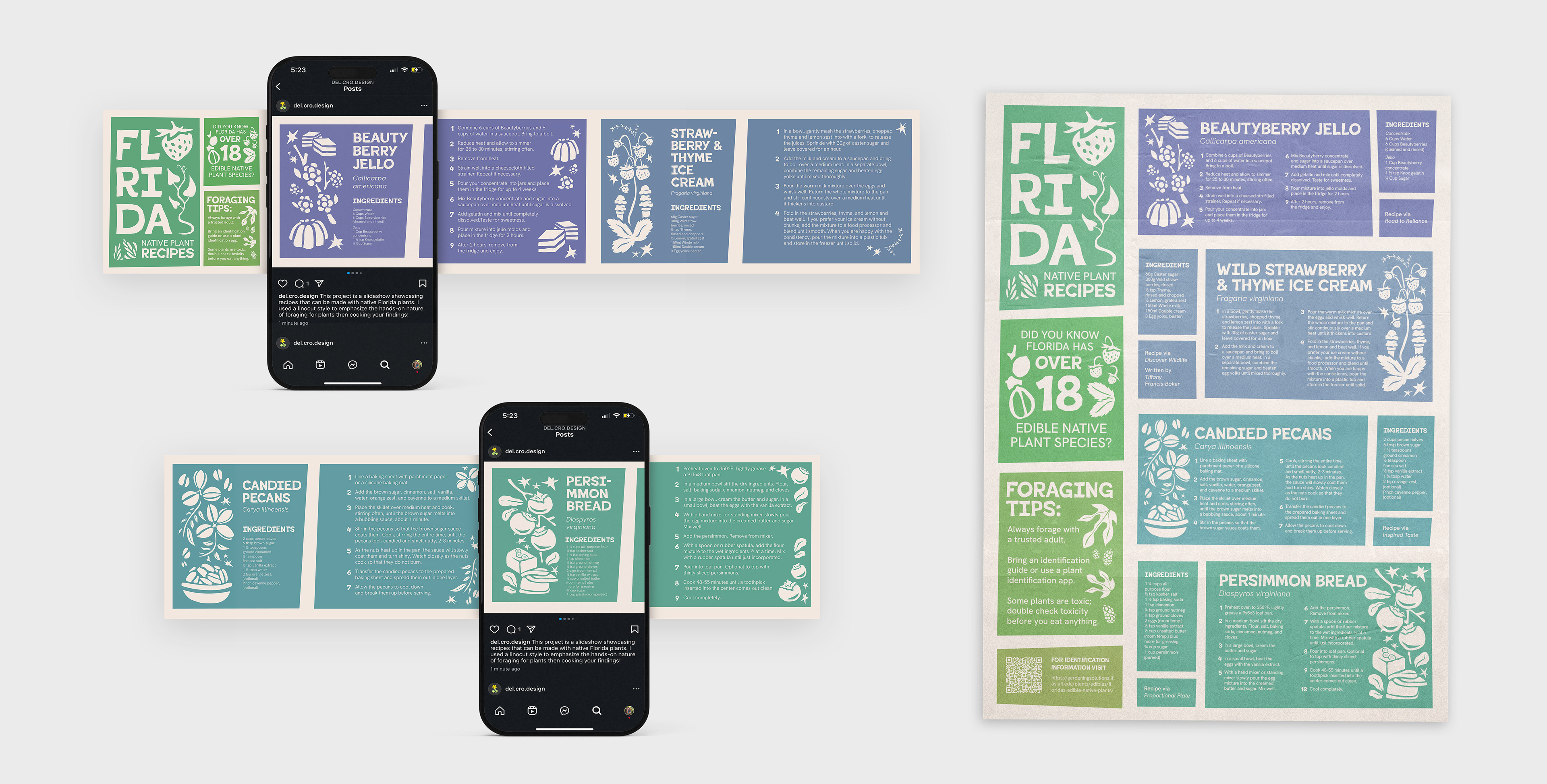
Mockup of the social media carousel and poster.
PROCESS

Format & Medium Research
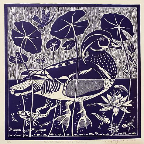
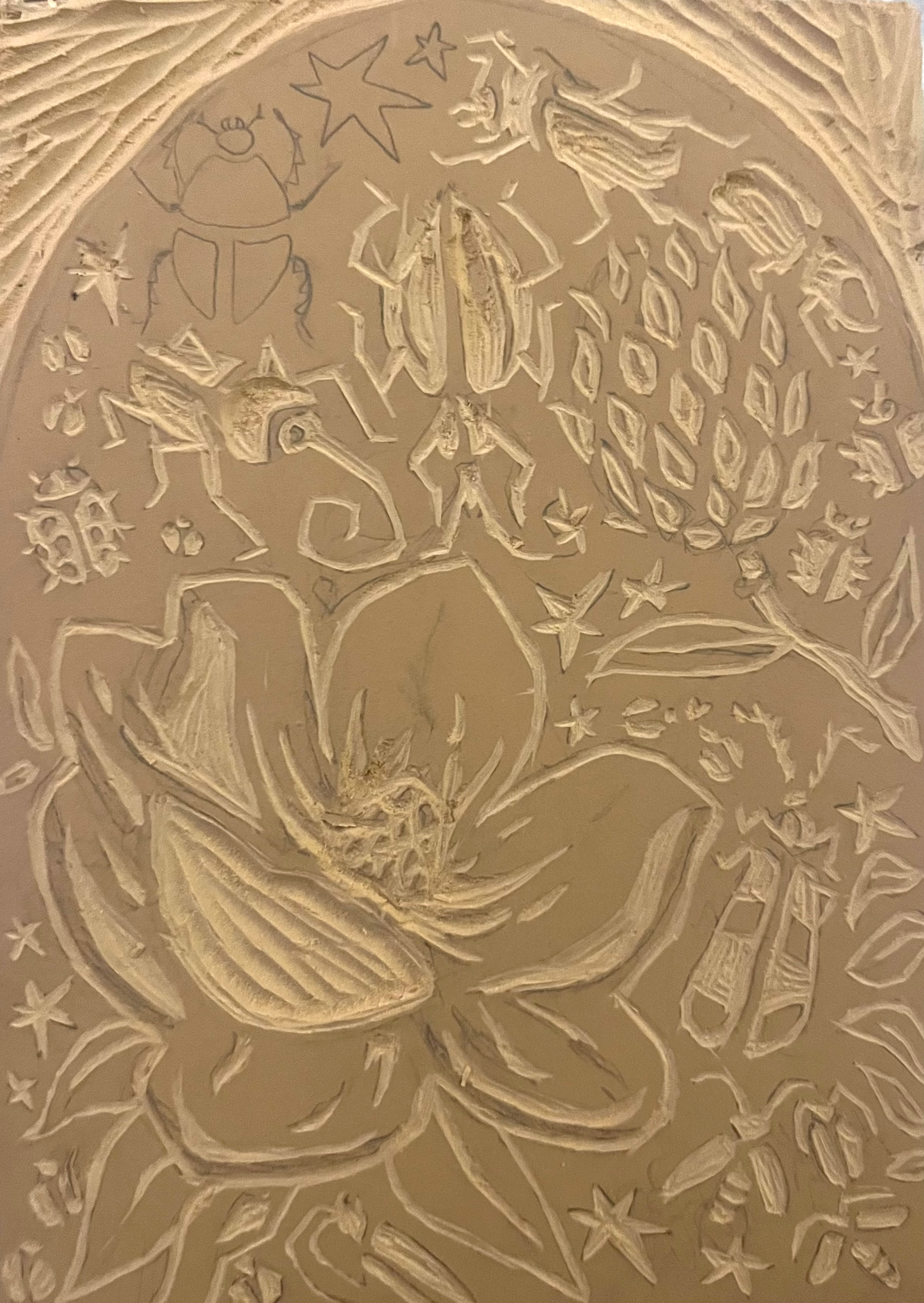
I began with research into both botanical infographic styles and the medium of linocut. I wanted to style the graphics on linocut to emphasize the hands-on nature of foraging and to appeal to a middle-school-aged audience with an art style less clean than other graphics they were exposed to, possibly even a style they had experience with.
My research resulted in creating a linocut myself to understand the process behind the art form's unique look. This helped me greatly when I created the linocut-esque graphics in Illustrator, as I was able to include small mistakes and inconsistencies similar to those I made in my real life linocut.
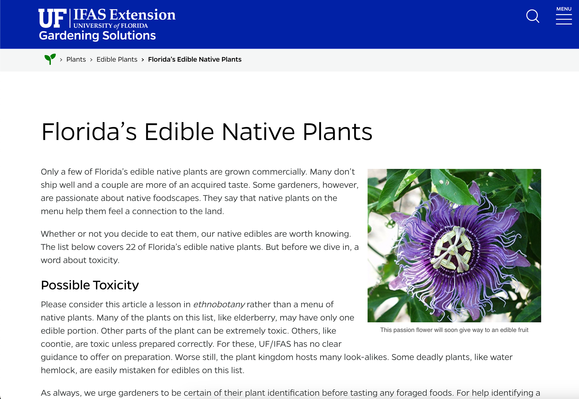
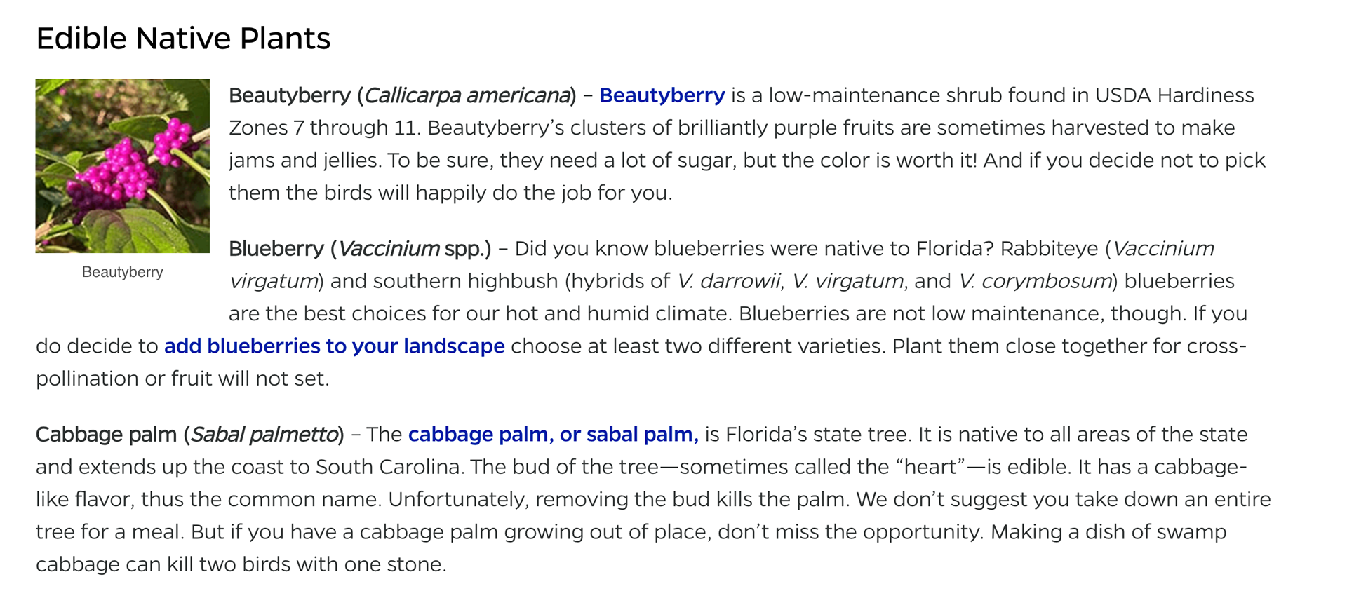
Native plant research
At the same time I was doing visual research, I was also researching Florida's edible native plants. I used my university's native plant database to find plants that I was familiar with and knew would be easy for middle schoolers to forage.
I originally intended for my infographic to be about identifying native plants but had to pivot because an identification guide stylized as a linocut would not serve the purpose of identification very well.
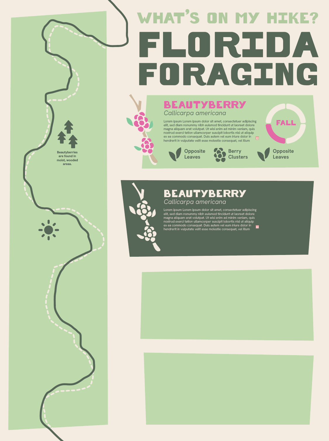
first drafts
Before I switched to creating a guide to native plant recipes, I styled the infographic as a map to encourage middle schoolers to get out and hike. However, it was just so... boring. Nothing about it would catch my audience's eye and encourage them to read the information. The colors were too pale and the graphics didn't have much meaning.

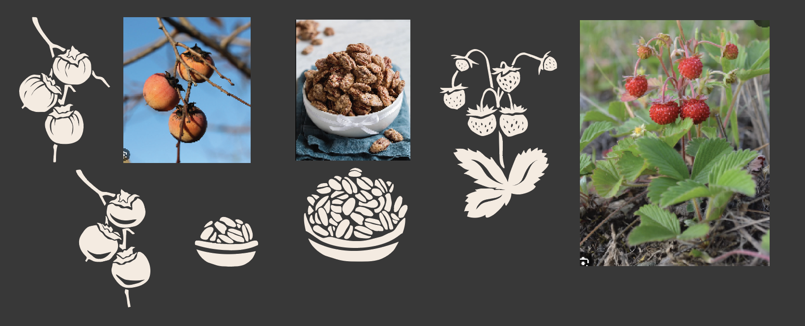
Illustration
After pivoting to use recipes, I decided to create graphics integrating the native plant with the dish it was turned into. Using reference images, I drew with the my mousepad and Illustrator's pencil tool set to maximum sensitivity, aiming to capture the shakiness of my movements the way a real linocut tool would.
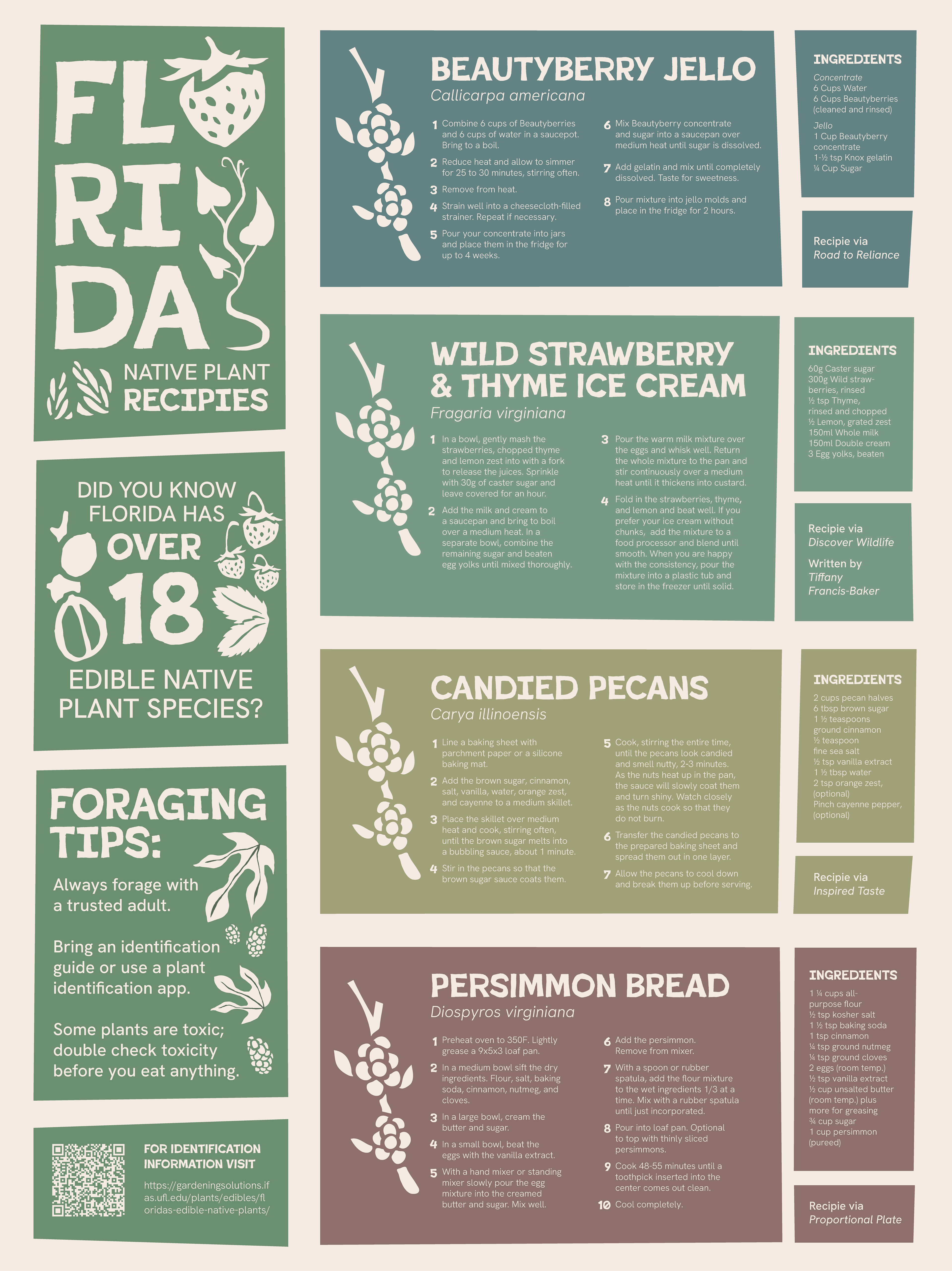
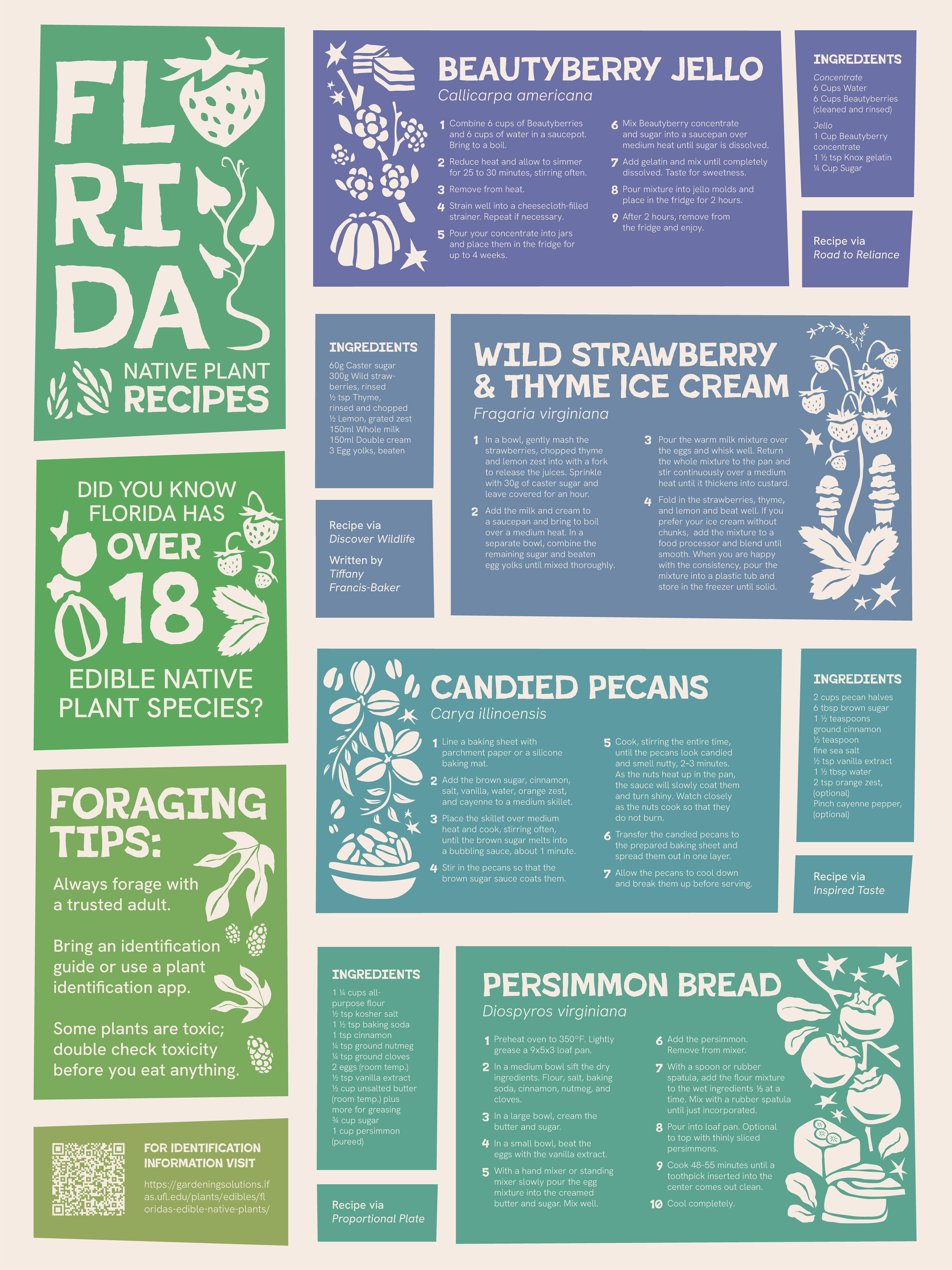
Color drafts
With the illustrations and text placed, I tried two different color schemes and layouts. The second layout and brighter one made the graphic more playful and better suited for a younger audience, so it was chosen for the final poster.