
The Ask:
Lead the Creative Direction of Emic Anthropology Magazine, including launching a rebrand and increasing brand awareness. Emic is an online and print Arts & Letters magazine showcasing student art and writing submissions as well as editorial pieces, research, and professor interviews.
The Answer:
A rebrand and social media overhaul focused on emphasizing our anthropological approach, concurrent with the development of the branding and theme of four issues: Bloom, Cosmosis, Movement, and Stasis. Browse Emic for yourself here.
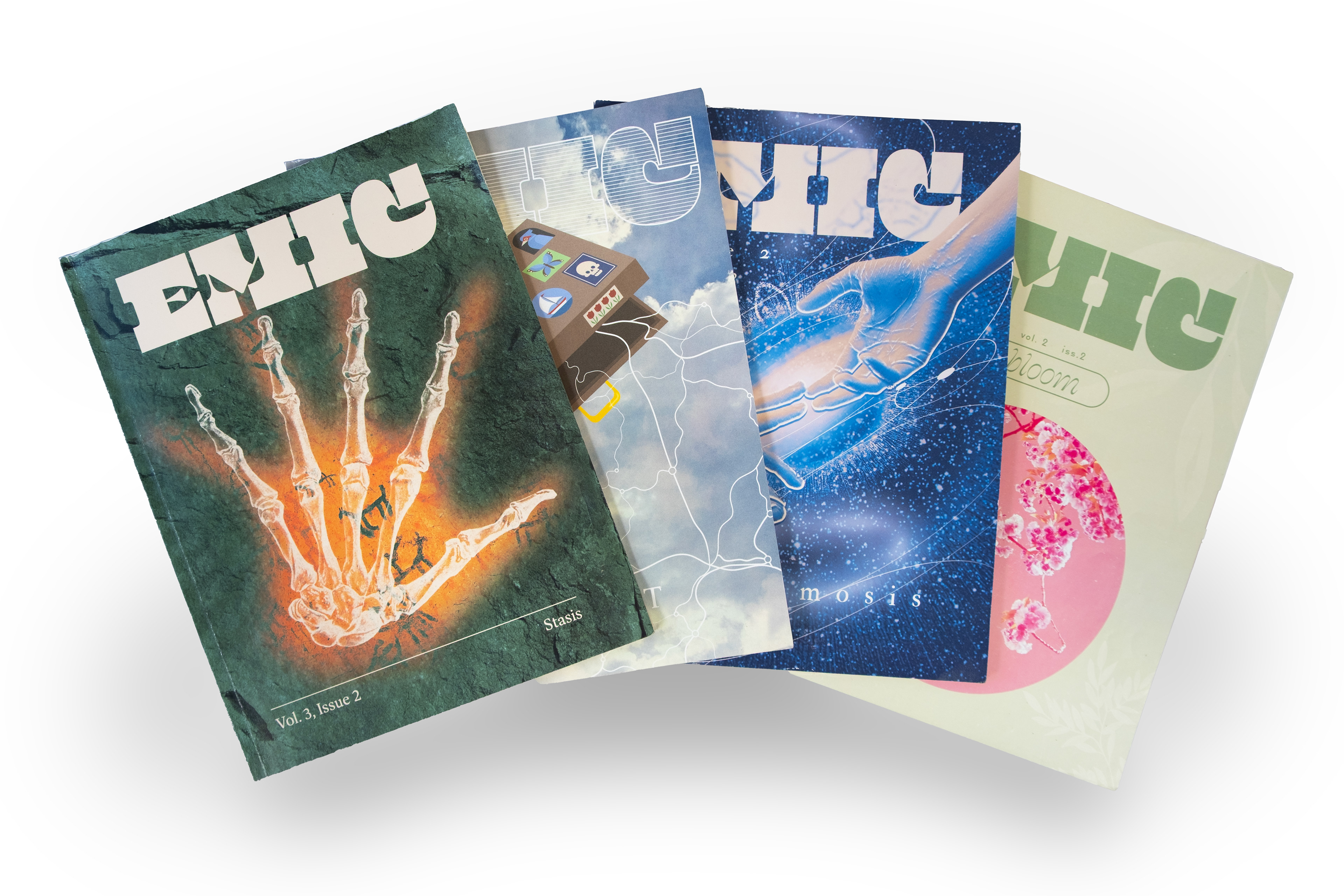
From left to right: Stasis, Movement, Cosmosis, & Bloom. I designed all covers besides Bloom.
The Rebrand
A central issue Emic faced was a lack of brand recognition. Audiences didn't understand what made us different as a magazine, and were therefore hesitant to engage with our content. We solved this issue through executing branding focused on our tagline: "What does it mean to be human?"
Our new color palette remained simple, with an off-white and three shades of green. We added Nitti to our typefaces, which provided an academic, objective contrast to our stylized Beasty typeface. Finally, I created the repeating hand motif to complement our brand as a background or pattern. These hands reference the shared humanity of our viewers and contributors, whom we strive to connect to each other and the field of anthropology.
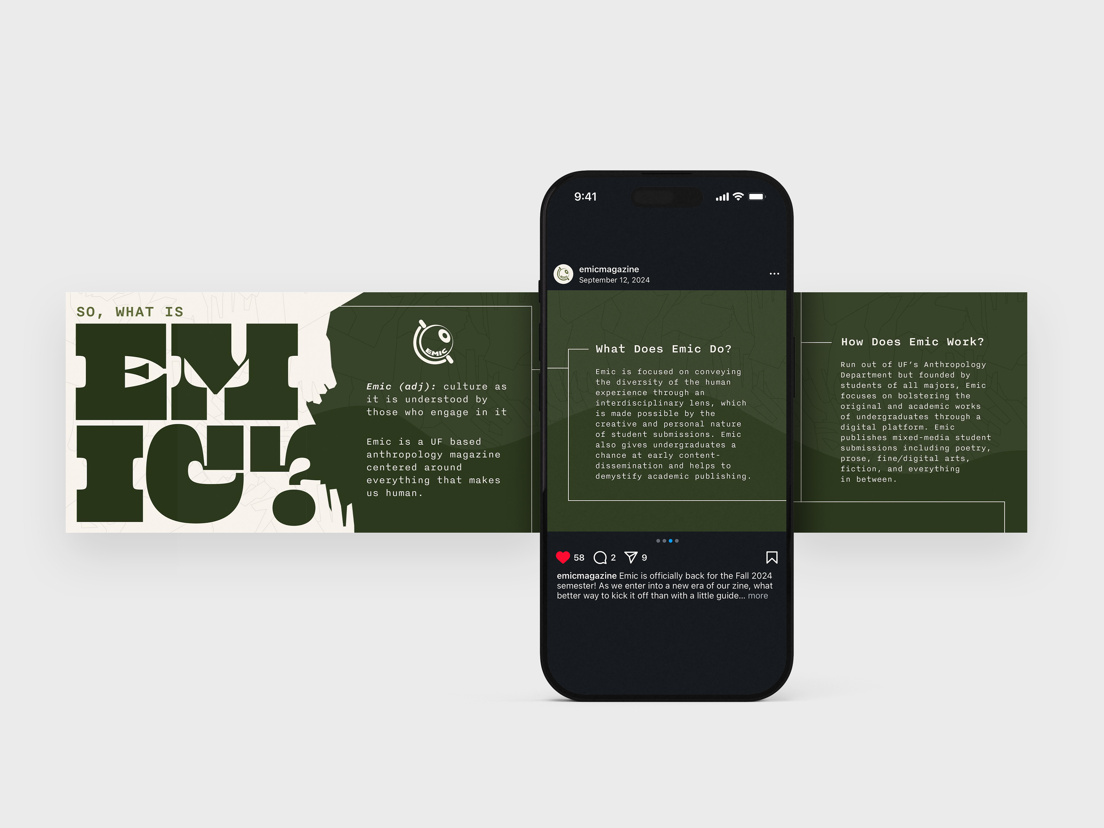
My rebranded social post introducing Emic.
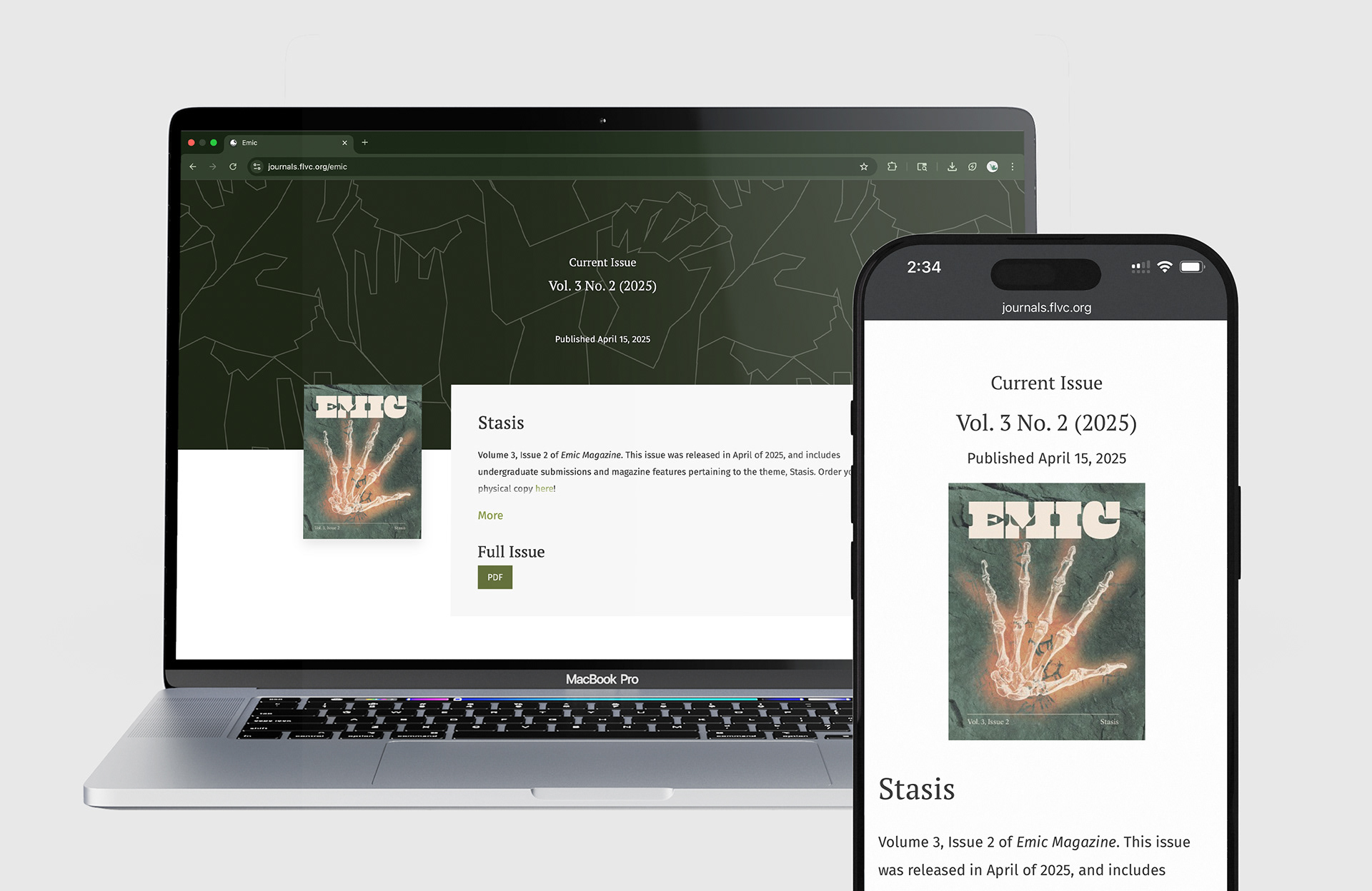
Website rebrand, featuring Stasis.
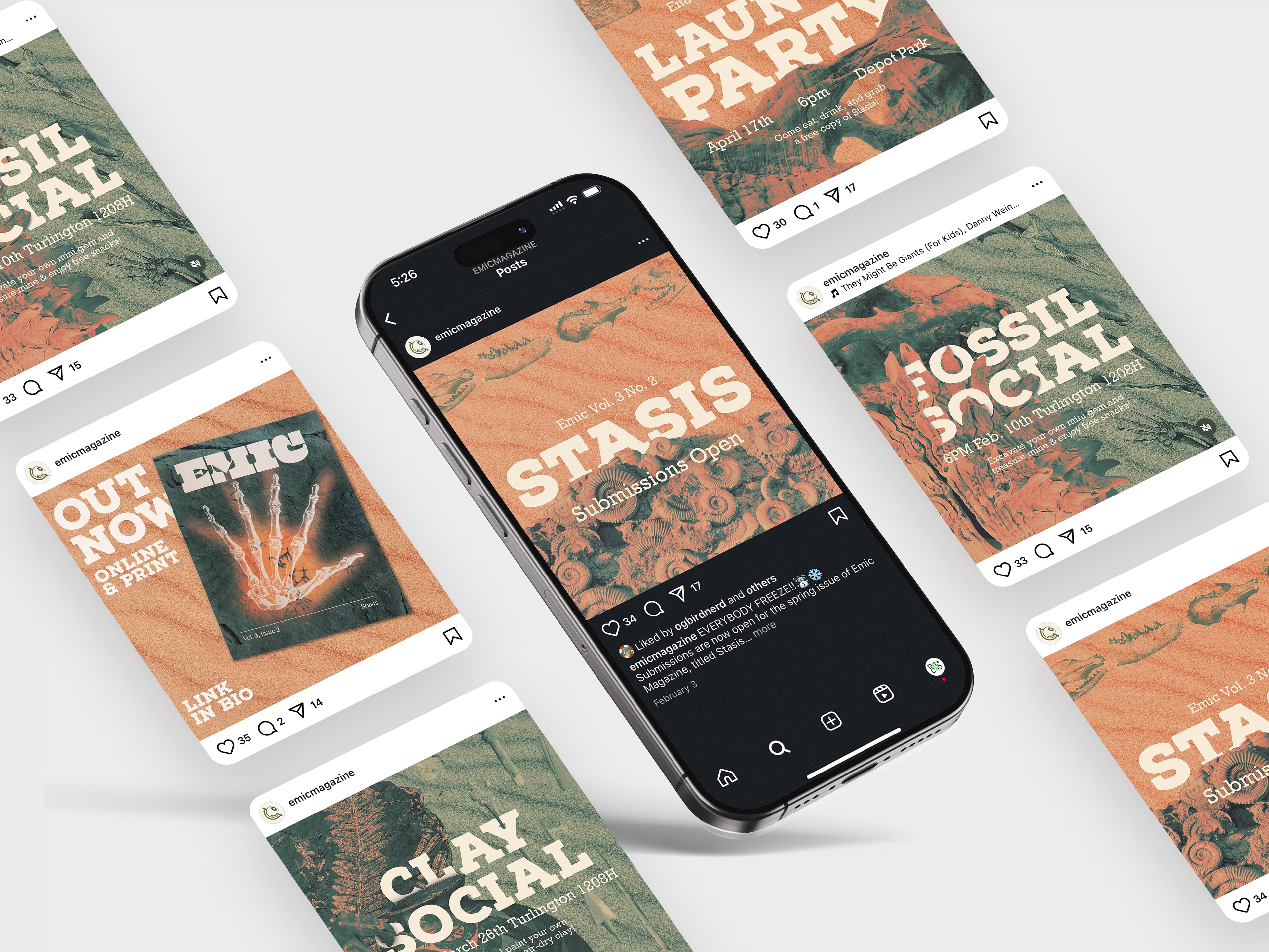
Selection of social posts I created for Stasis.
Social Media
To further increase brand awareness, we increased our social media presence, sharing issue-branded posts to keep our viewers in the loop with socials and magazine launches.
Our increased presence, combined with our rebrand, had an incredible impact: we gained 200 instagram followers and tripled our launch party turnout for the launch of Stasis.
Case Study: Cosmosis
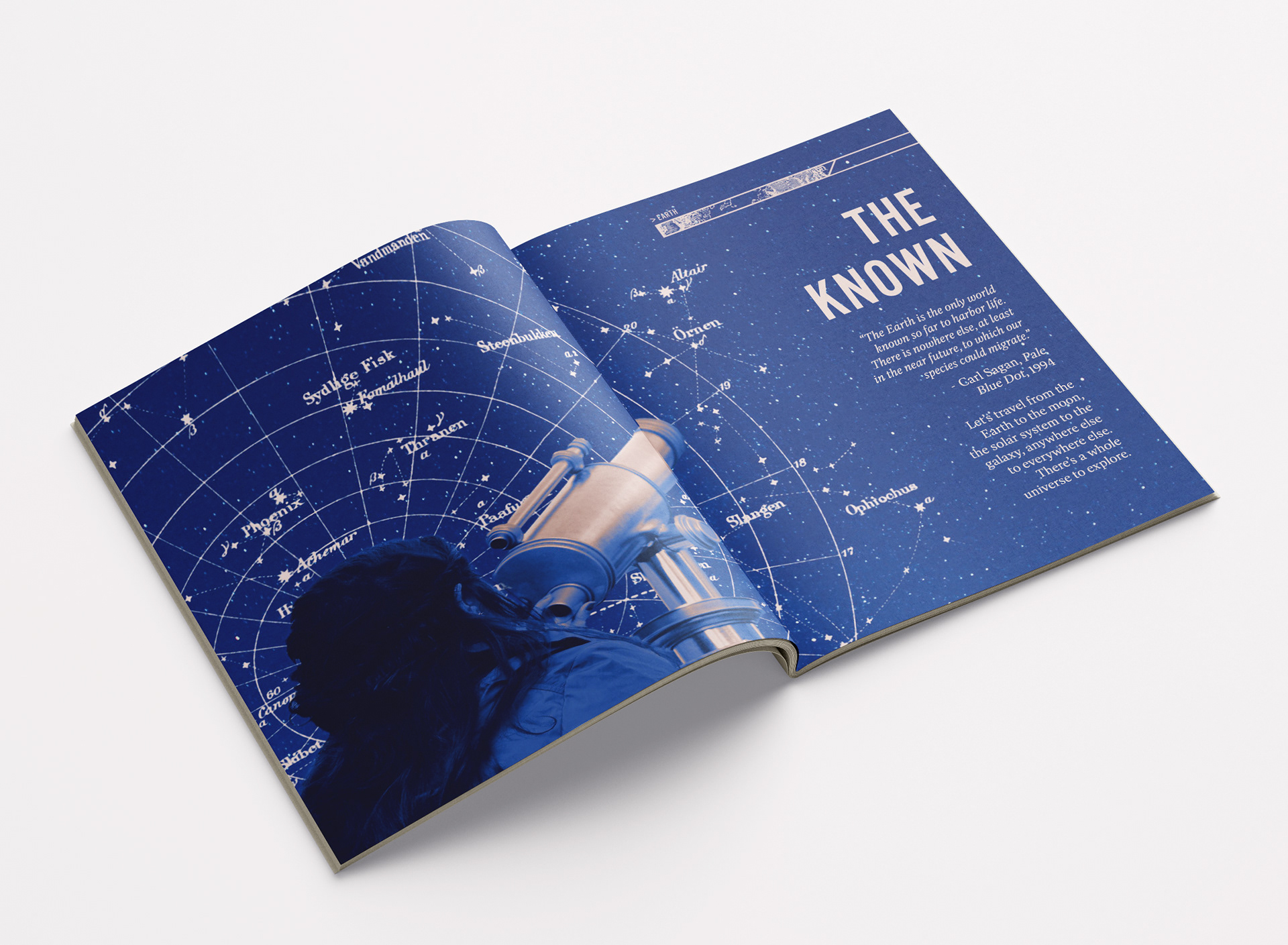
The opening theme spread I created.
Volume 2, Issue 3, was themed on Cosmosis: our connection with the universe we inhabit.
The issue was framed as a journey through the galaxy, from the known to the unknown. We began on earth with a two-page "theme spread" of someone looking to the stars, the way humans have done for hundreds of years. As the reader moves through the magazine, they are guided by a road map header positioning them in their journey.

Additional spreads I created, viewed digitally. On the far right is a section divider, used at crossing points of the roadmap to further immerse the reader in their journey.
Cosmosis closes while looking toward the unknown. The reader has traveled from our Earth to the edge of the universe, and this theme spread is meant to inspire within them a spirit of curiosity that extends past the reading of our magazine. You can view the full magazine here.
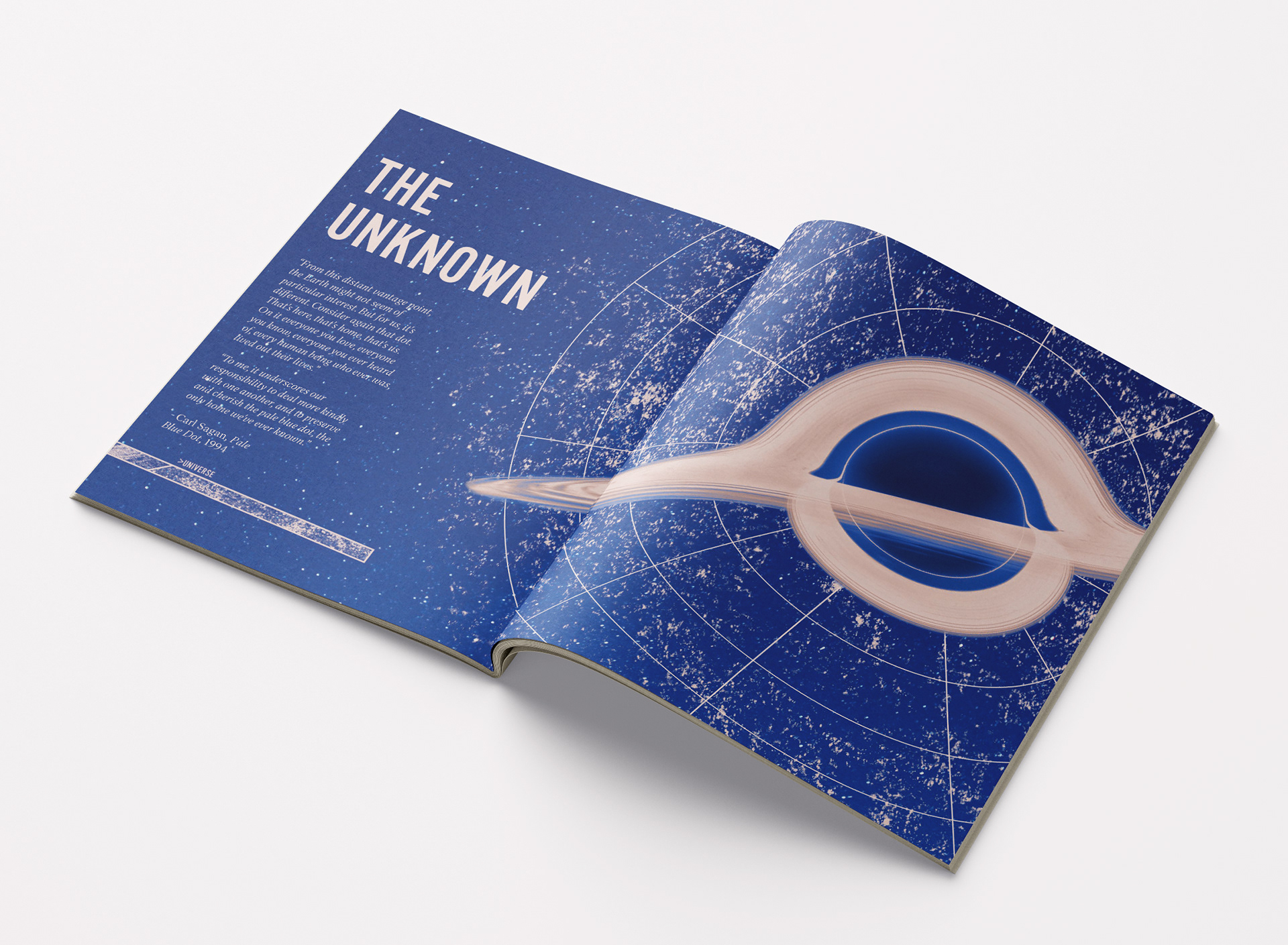
The closing theme spread I created.