
THE ASK:
Create a T-shirt and packaging design protesting a social issue.
THE ANSWER:
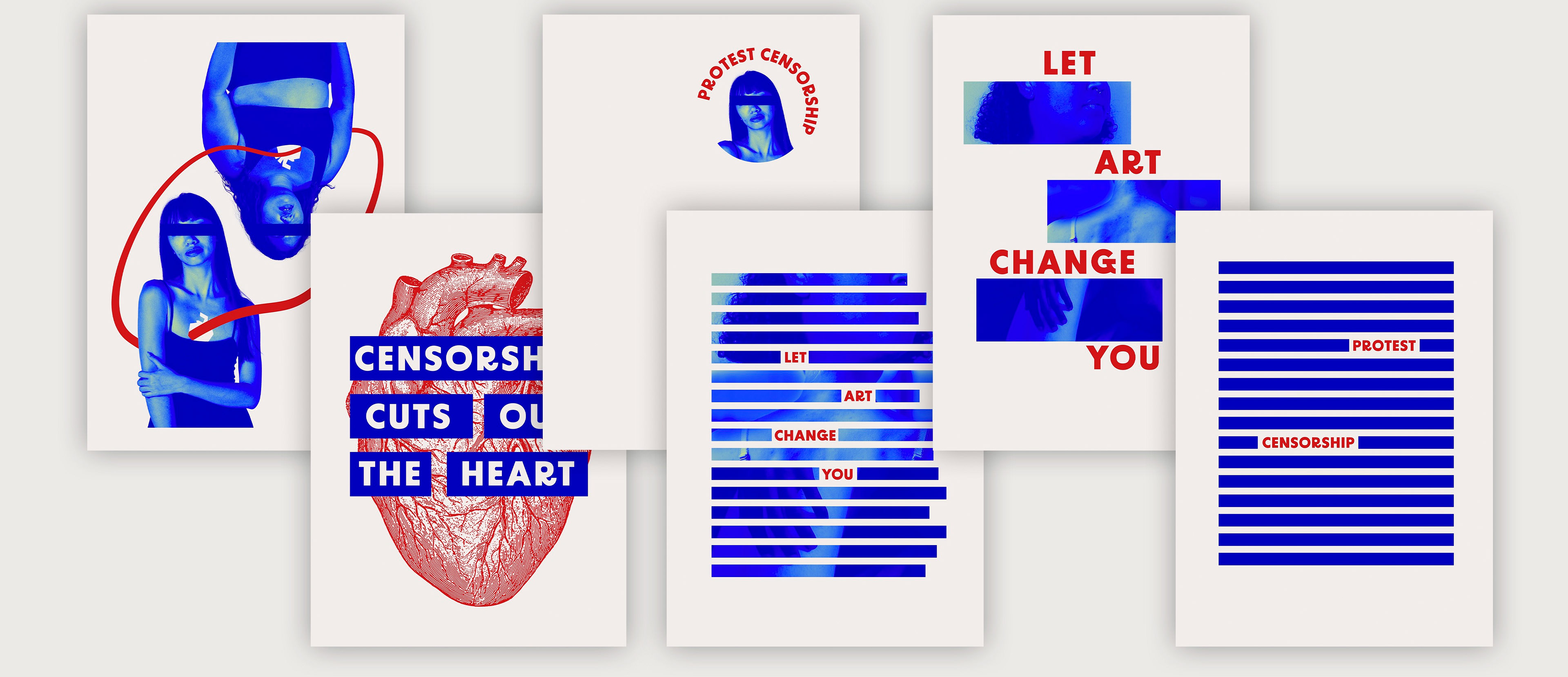
A design inspired by the Anti-Design movement, with intentionally distorted typography, loud colors, and a package that requires interaction to see the “uncensored” content underneath its sleeve.
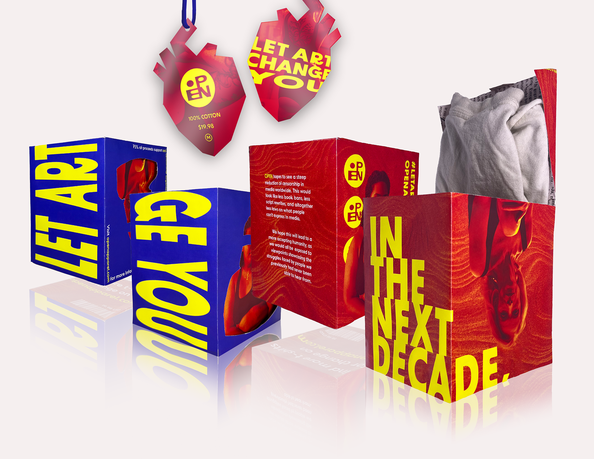
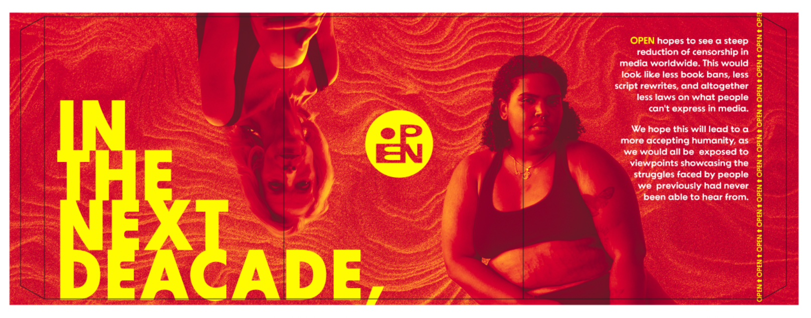
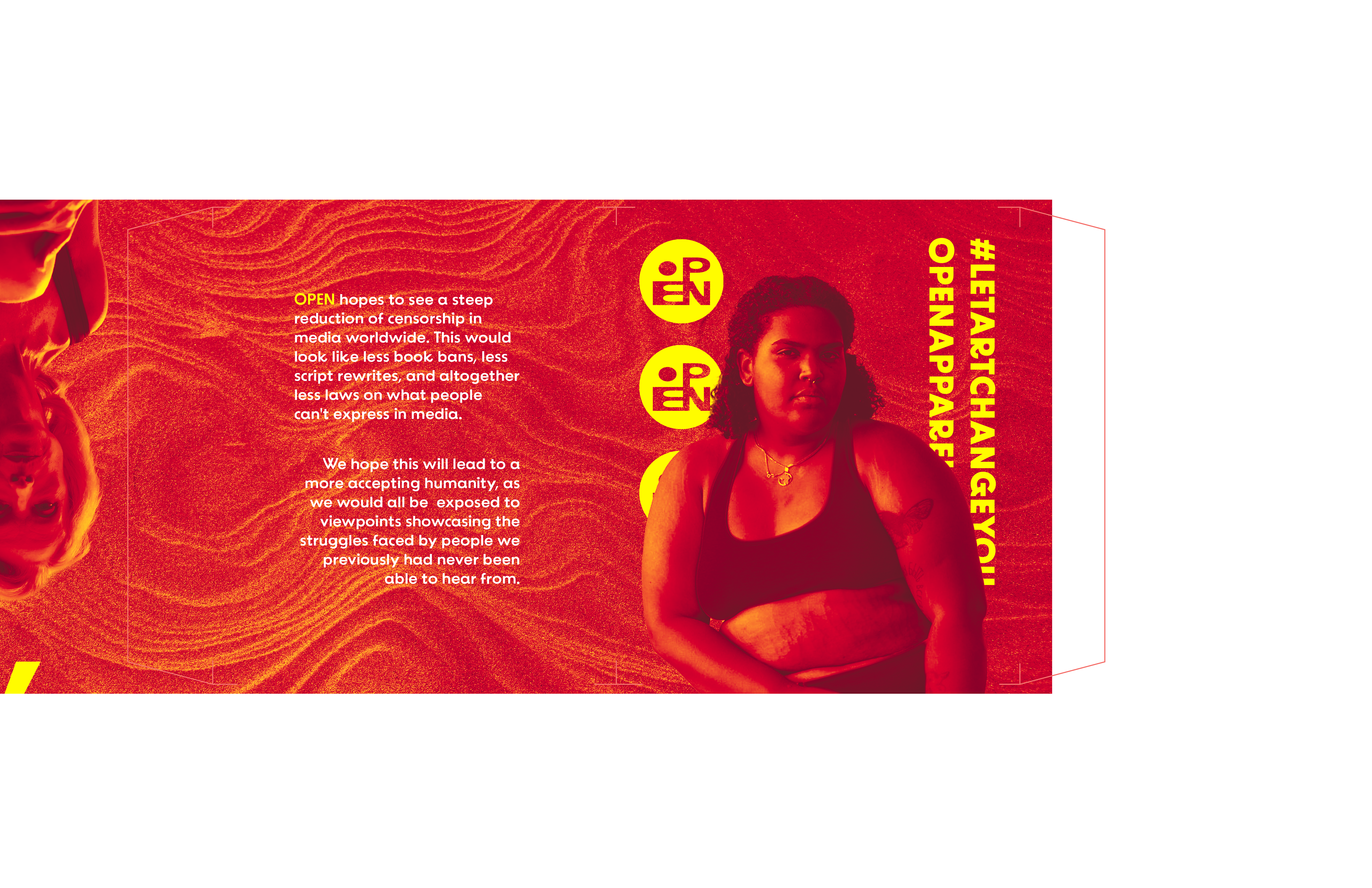
Packaging and tag mockup. Package photos were taken and edited together; the tag is a digital mockup.
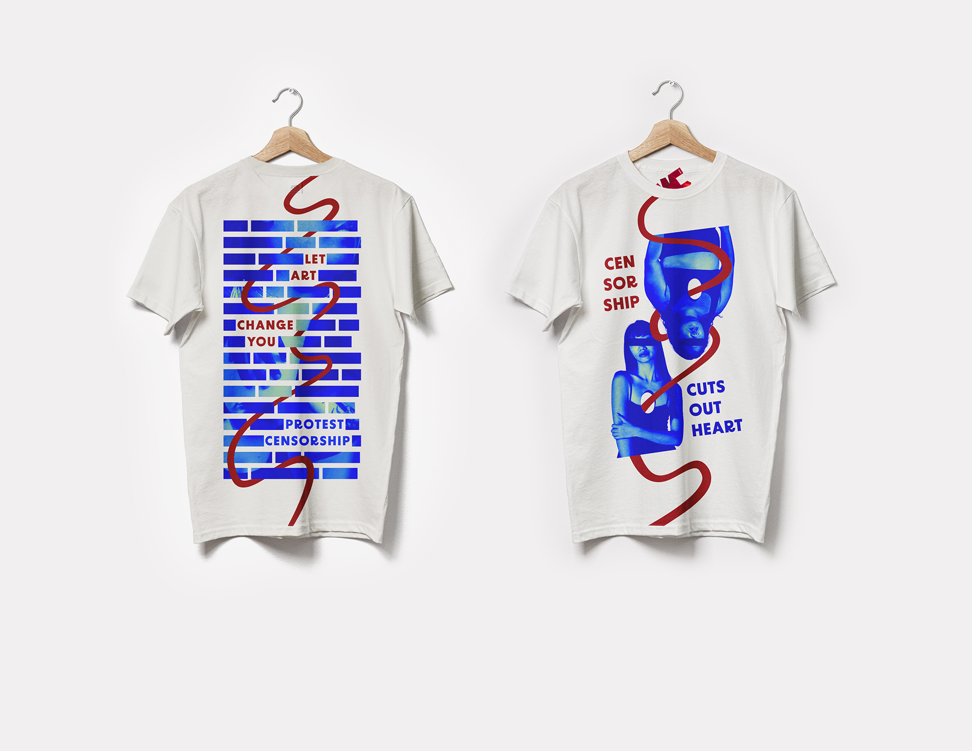
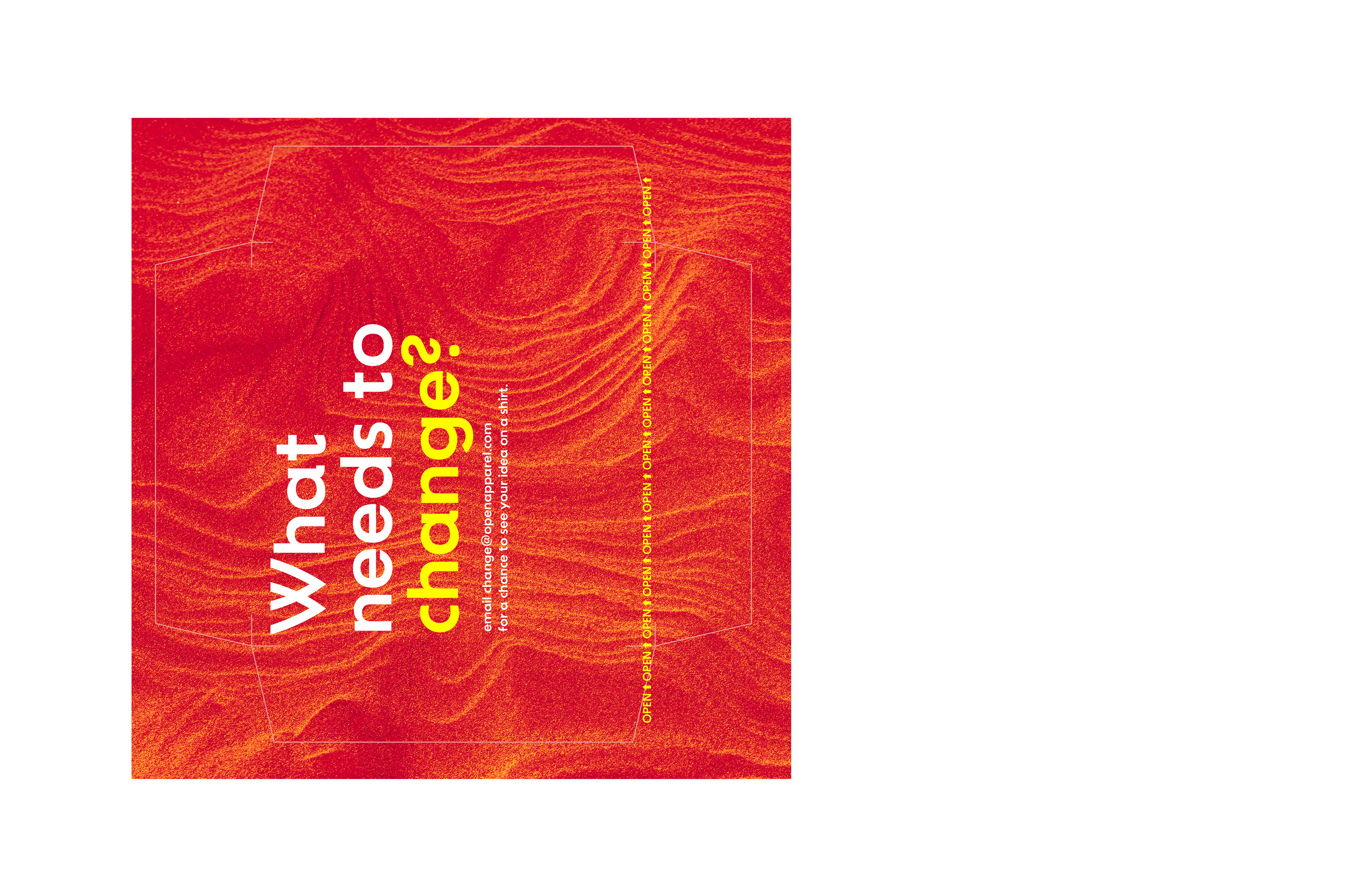
T-shirt mockup.
PROCESS:

Audience Research
I began by interviewing a colleague of mine and who fit the persona this project was targeted at. So-called "Jamie Hart" was a college aged student who has experienced censorship of his own work and is concerned with the impact the censorship of artists will have on the free flow of ideas and knowledge.
This interview provided me with insight into aspects of artist censorship I should to address with my design to attract my target audience. Most notably, Jamie is concerned about the censorship of marginalized voices, and thinks that in order to combat censorship we need to adopt a more open worldview and advocate for education about censorship.
IMAGE Research
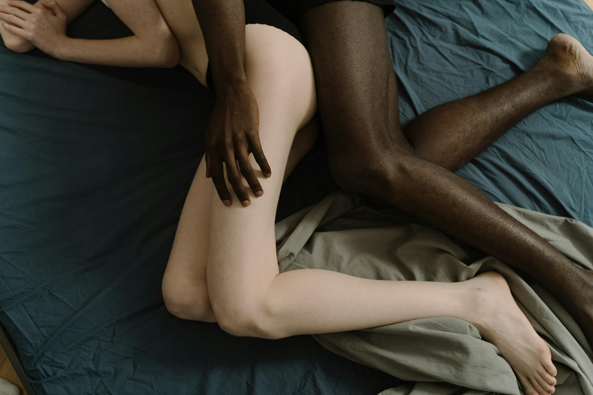
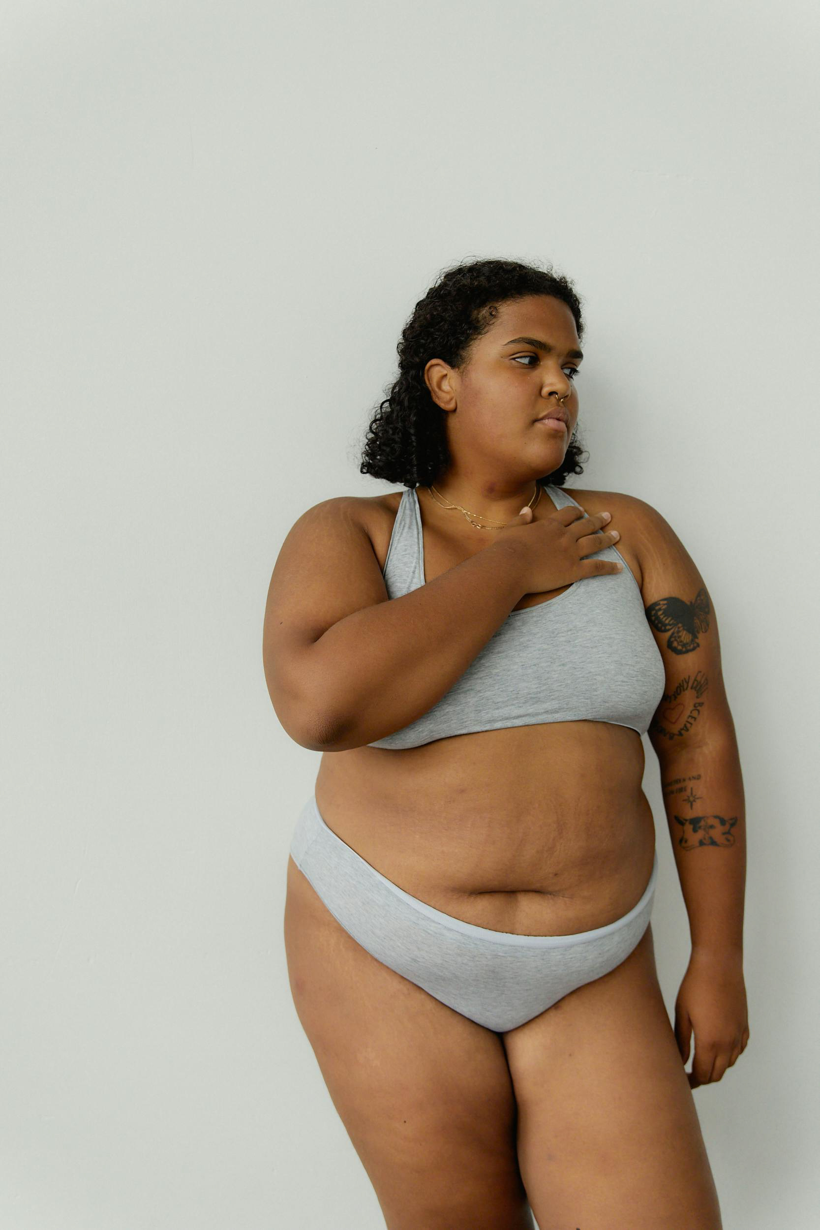
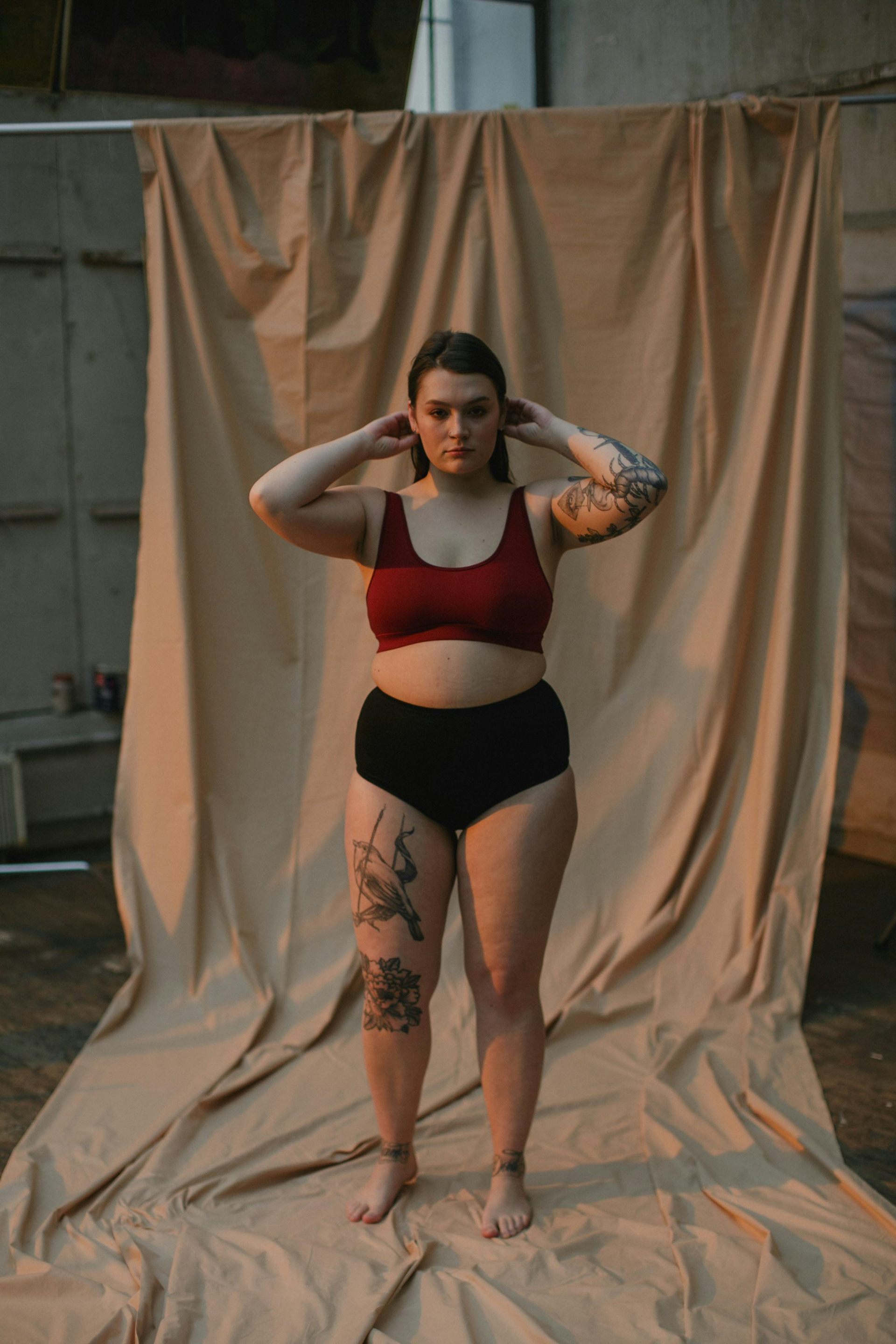
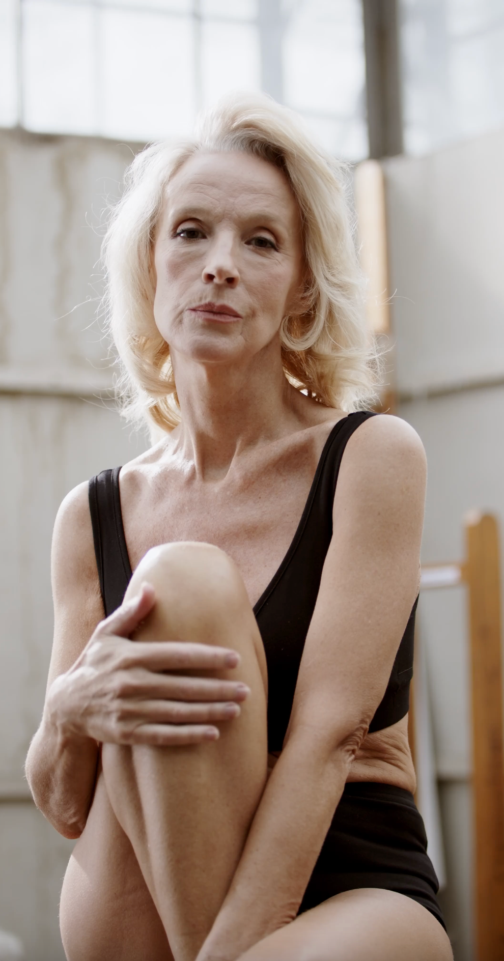
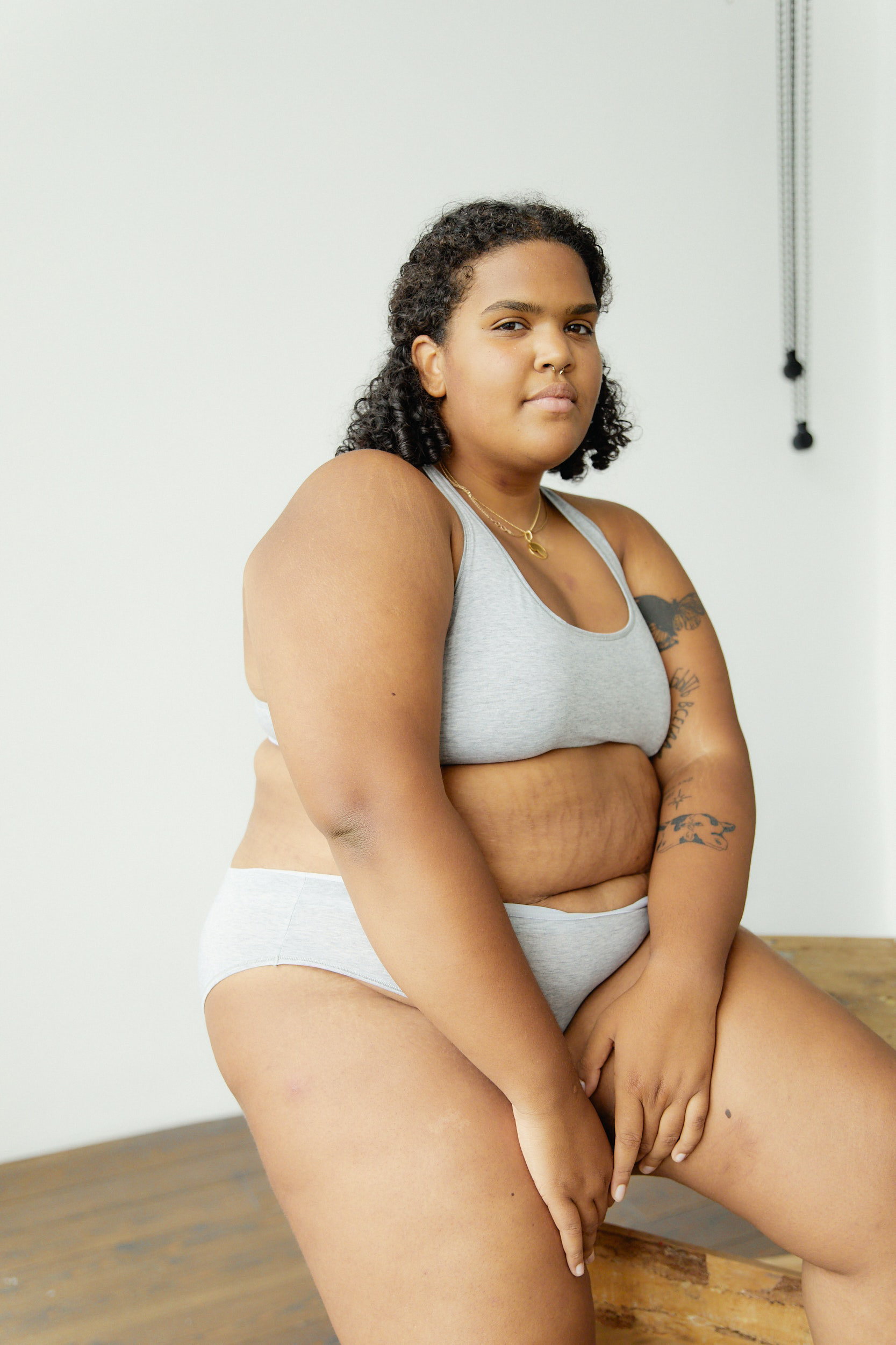
I moved to Pexels to gather the images I would use on the shirt. Considering Jamie's concern about the censorship of marginalized voices, I sought out models from marginalized groups. The first two images were used on the front of the shirt, and the last three were used on the back.

TYPEFACE CHOICE
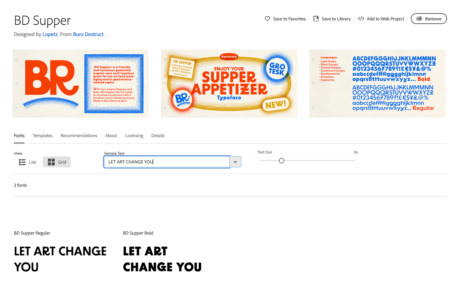
After writing the tagline "Let Art Change You," Reflecting Jamie's sentiment of keeping an open mind, I tried out dozens of typefaces. The best fit was BD Supper, a serif that immediately stood out with its humorous character. Although advertised as being "good on food packages," BD Supper ended up suiting my tagline perfectly thanks to its clean but unique letterforms, adding a spark of playful artistry to my heavy topic.
FIRST DRAFTS
With my images gathered, I took a few days in Photoshop to imagine different ways they could be arranged and edited on the shirt.

Putting it all together
I solidified the layout I wanted and finalized the images and gradient mapping in Photoshop. Then, I moved everything into Illustrator to add the line through the models' hearts and the censored block of text on the back. Finally, I moved back to Photoshop and placed the design onto a mockup.
The shirt was done — onto the packaging.
IMAGE GATHERING & MAKING
I grabbed more photos from Pexels, again focusing on marginalized populations, and created a quick logo in Illustrator for the T-shirt brand.

FIRST DRAFTS
I drafted the inside of the package and tag designs, then refined them in a peer critique.


CREATIng the dyeline
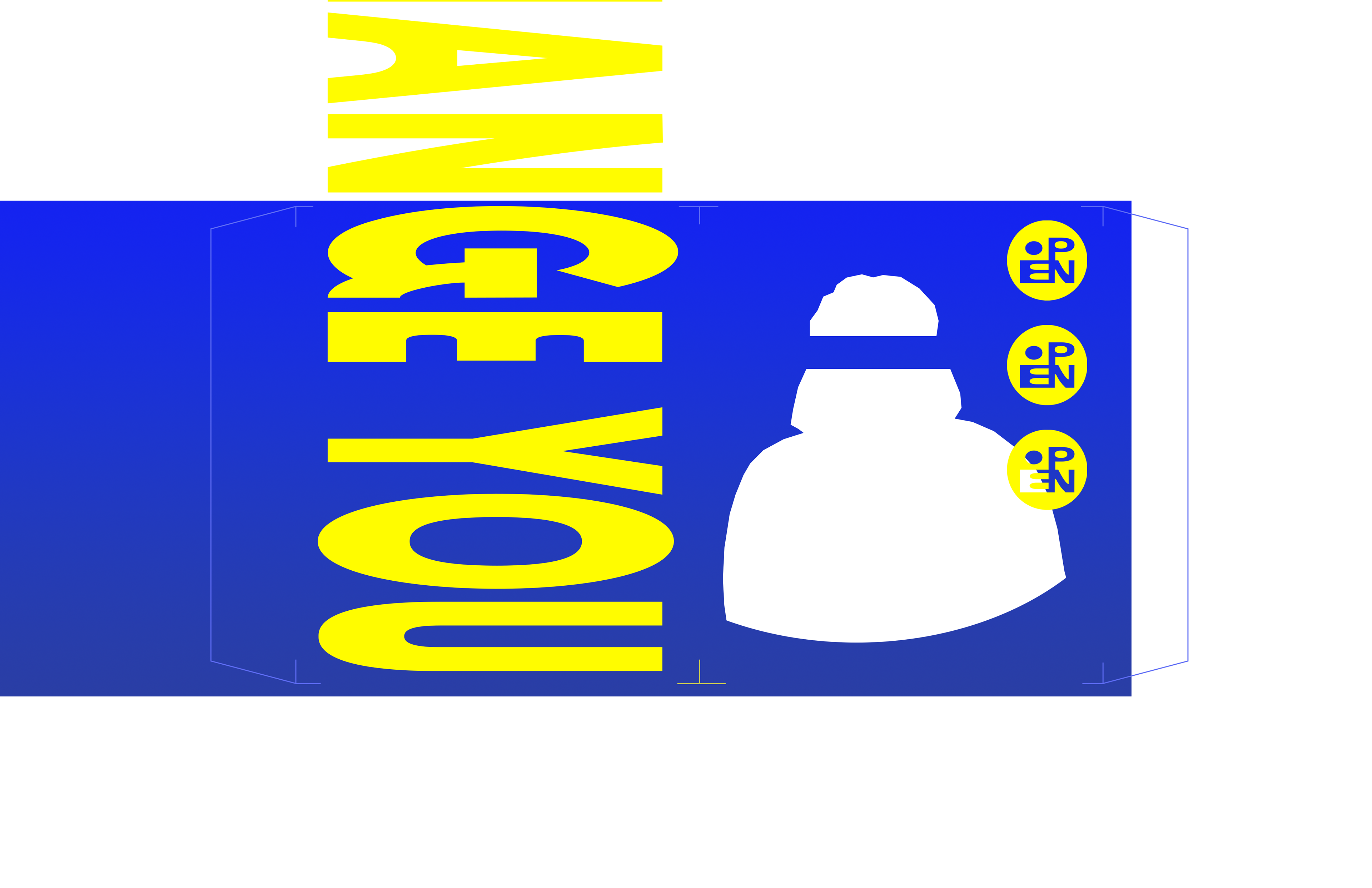
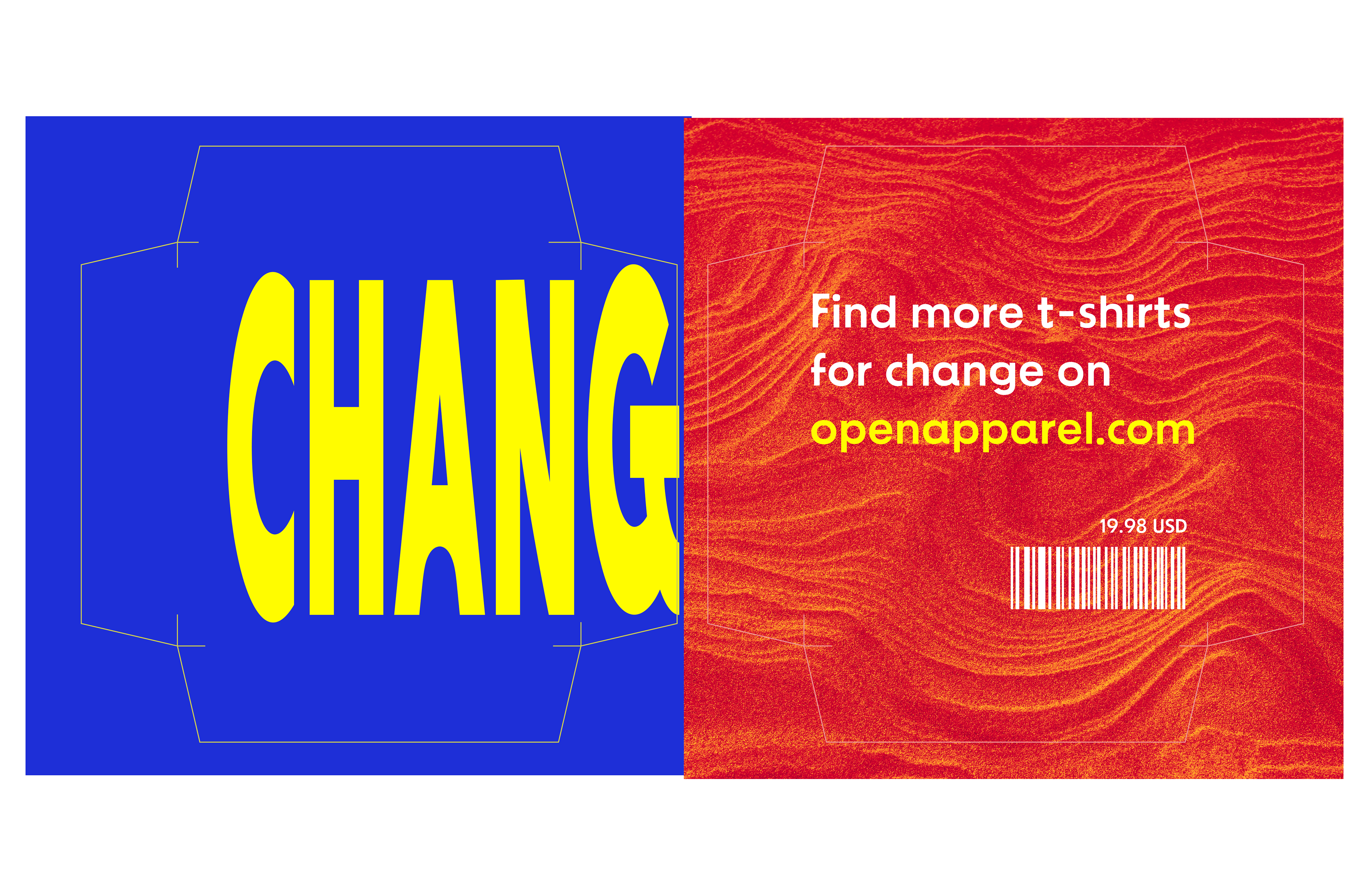
I created rectangular box with a blue sleeve on the outside that had to be removed to reveal the uncensored red interior, representing the "heart" of the design. The box features wrapping text so that it must be rotated and examined for a viewer to get the full picture.
Due to the fact I only had access to 11x17 paper, I had to get creative with the dyeline. It was split into 7 sections that could be glued together to make the final package.

wrapping up
I printed the package, assembled it, and photographed it with a T-shirt inside. I then mocked up the tags and placed them above the compiled package images.