THE ASK:
Redesign a book cover in the International Typographic Style.
THE ANSWER:
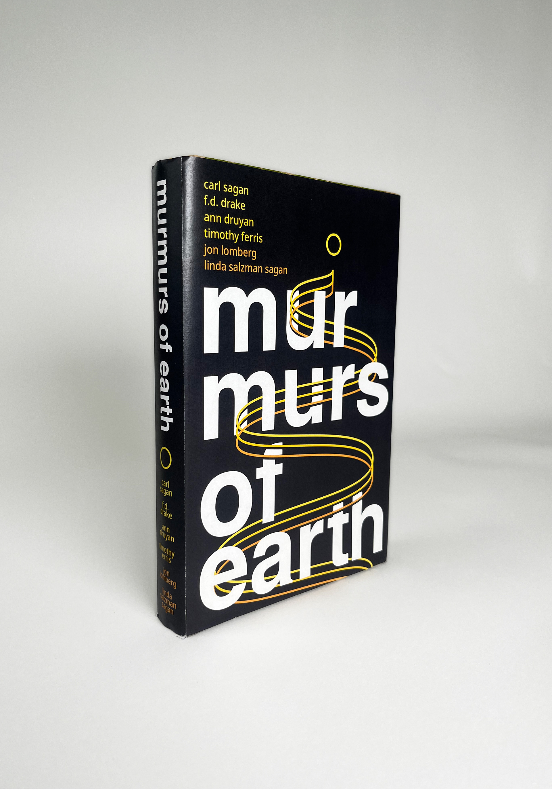
A book cover utilizing minimalism to allow for multiple interpretations of the same graphic. The central waveform represents the path the voyager probes took through space, the sound waves of the golden records upon them, and the winding path to the records' creation described in the book.

Mockup of the book's cover.
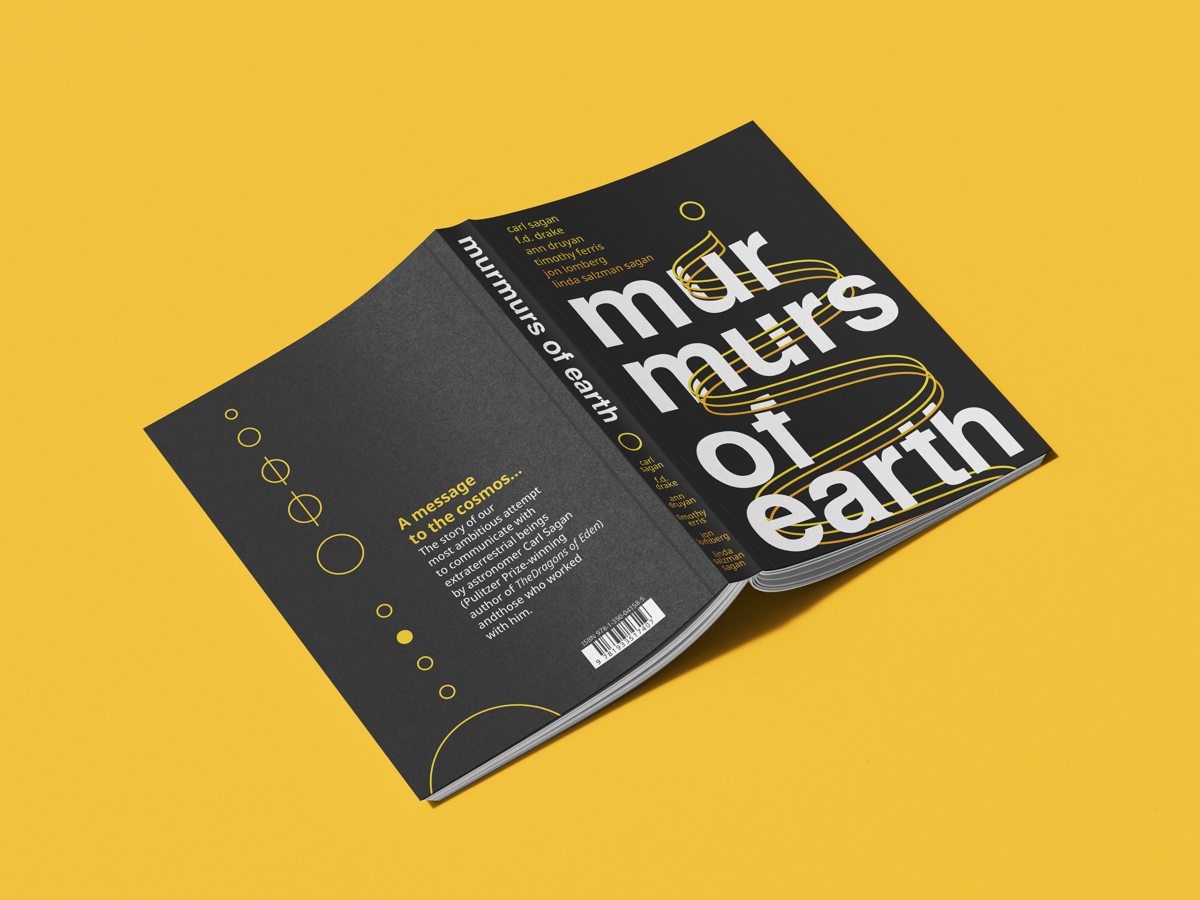
Mockup of the book showing the front and back.

Front of the printed book cover.

Back of the printed book cover.
PROCESS


Style Research
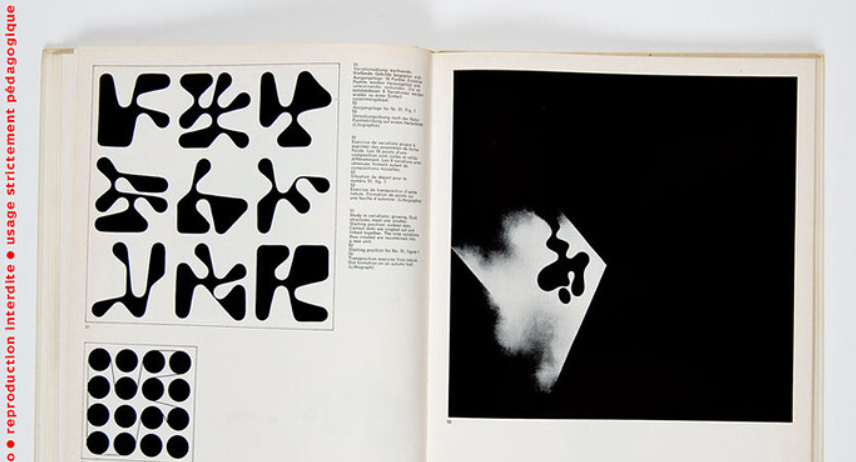
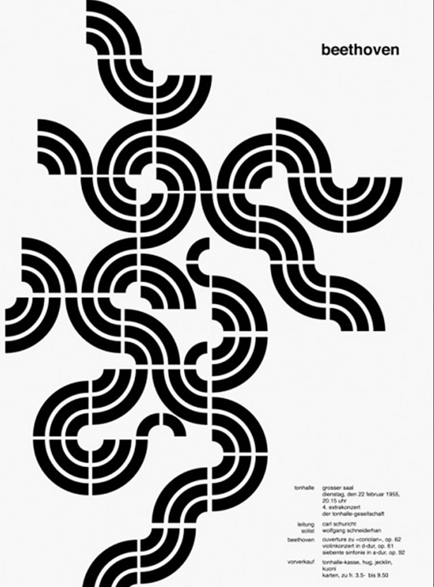
Although I was familiar with the International Typographic Style, I figured it would be a good idea to have reference images on hand while I worked. In my research, I found trends of abstract graphics, sans-serif typefaces (mostly Helvetica), and bright, limited color palettes.
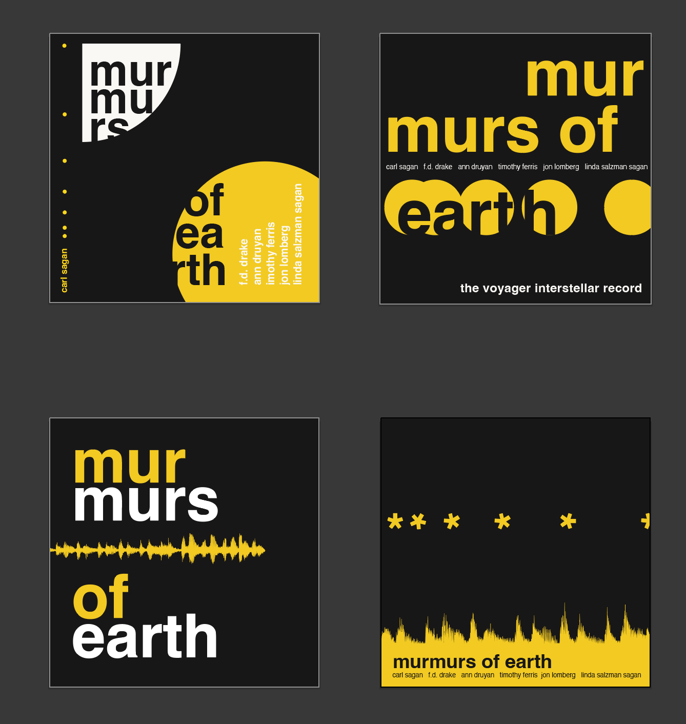


FIRST DRAFTS
After re-reading the book to refresh myself with its themes, I explored many directions for the book's cover. From my style research, I knew I would use Helvetica and a limited color palette. This still left me, however, with limitless potential for the central graphic. I first considered revealing words of the title in pieces, the way that receivers of the Golden Records would have to reconstruct humanity from bits and pieces on the record. The splitting of the word "murmur" from this idea stuck.
I also explored simplifying an audio waveform. This got more simple as my design progressed, and I realized that I could represent multiple things with the waveform pattern — notably the records' sound waves, their paths through space, and the path to their creation.
I originally imagined making a square cover that would fit the copy of Murmurs that I owned. Unfortunately, this resulted in covers that looked more suited to albums than a book, so I had to change gears.
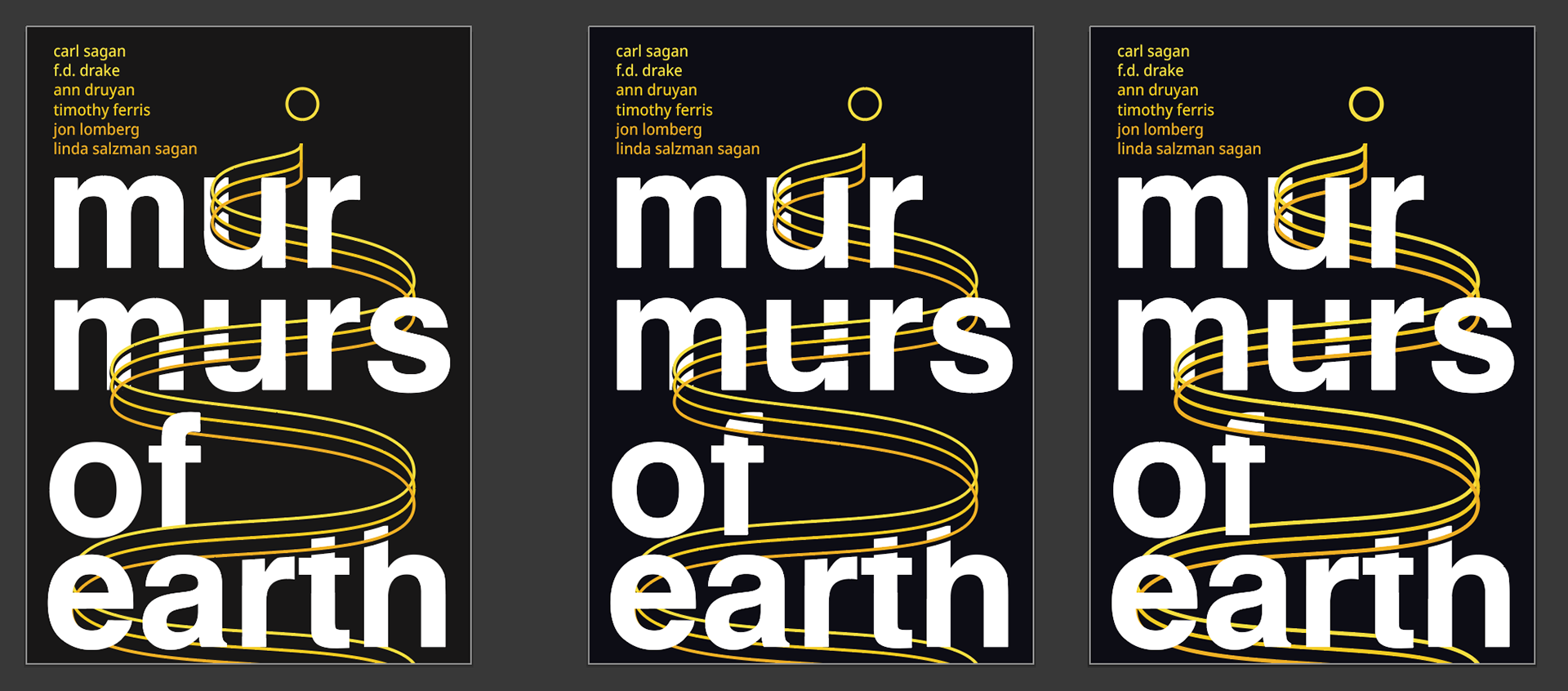

Line & Color testing
After re-arranging what I had into a portrait format, I tried out a few different line weights. In a critique, my peers said that the central one was thick enough to be seen, but not so thick as to disrupt the textual hierarchy
I moved into color testing, trying out two-color palettes but eventually. returning to the black background with a subtle gradient on the lines.
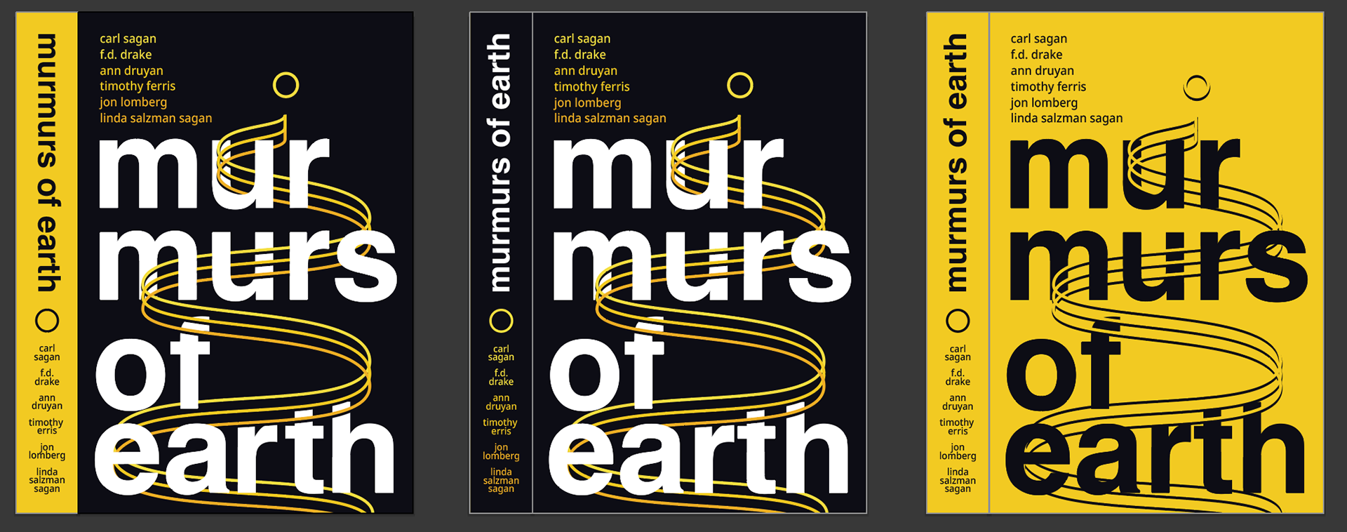
I designed the spine, again testing different colors. My peers expressed that a spine of the same palette was the most cohesive, and I ended up moving forward with that option.
I also designed a back cover with a simplified graphic of the solar system modeled after the graphic shown on the record's images.
PRINTING & PHOTOGRAPHING
Finally, I did a few test prints to refine the cover's size to fit the book model I was using, then printed it on a glossy tabloid sheet to mimic a glossy hardcover book sleeve and photographed it.