
THE ASK:
Using two arbitrary names, create a logotype using only the letterforms of their initials for six different businesses, then refine down to a single logo.
THE ANSWER:
A logotype and branding for Fairchild & Olsen Clean Energy leaning into the minimalist constraints of the project. What better way to convey clean energy than clean typography?
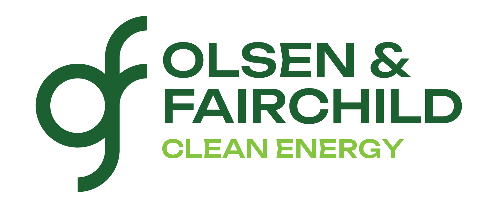
The logotype.
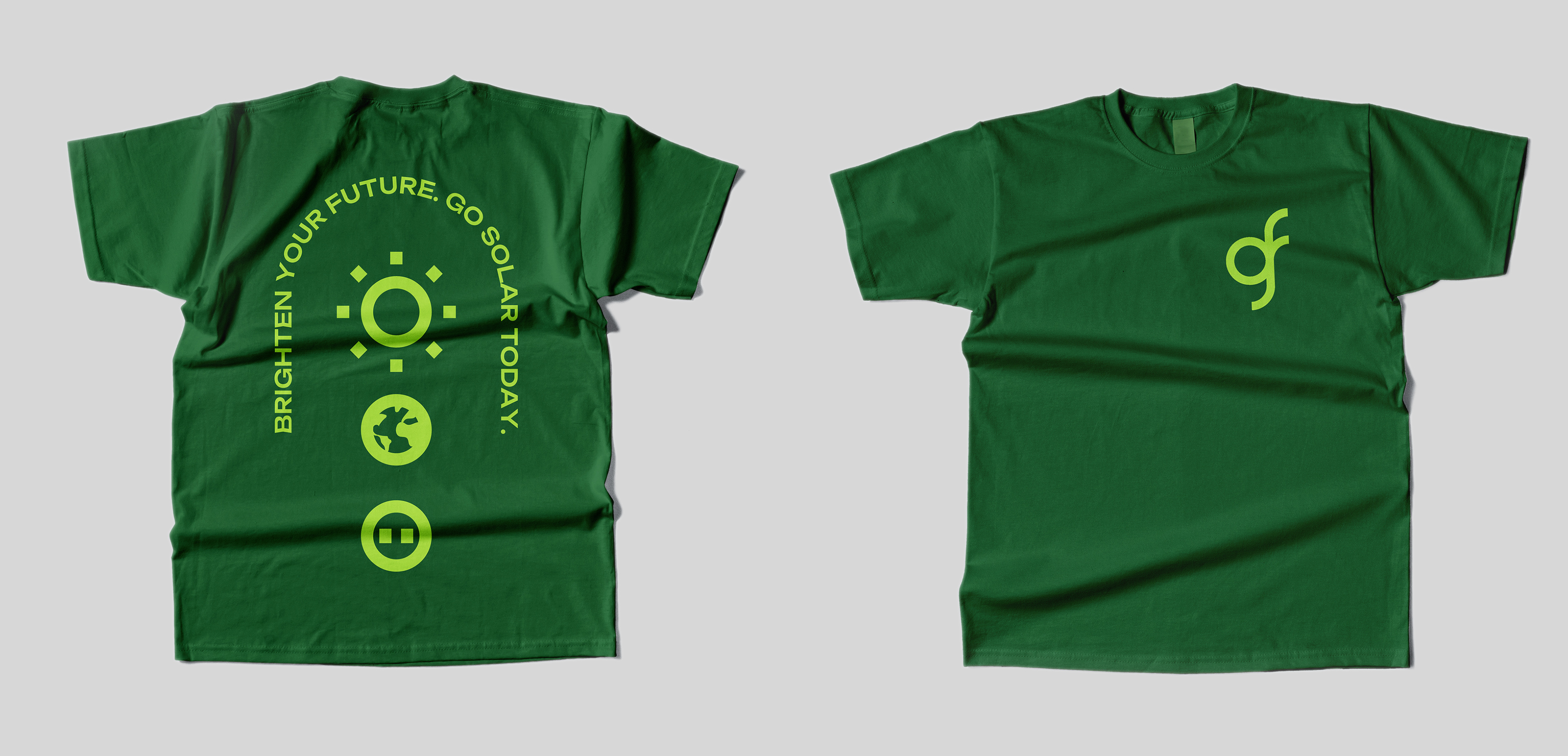
T-shirt mockup.

Sticker mockup.
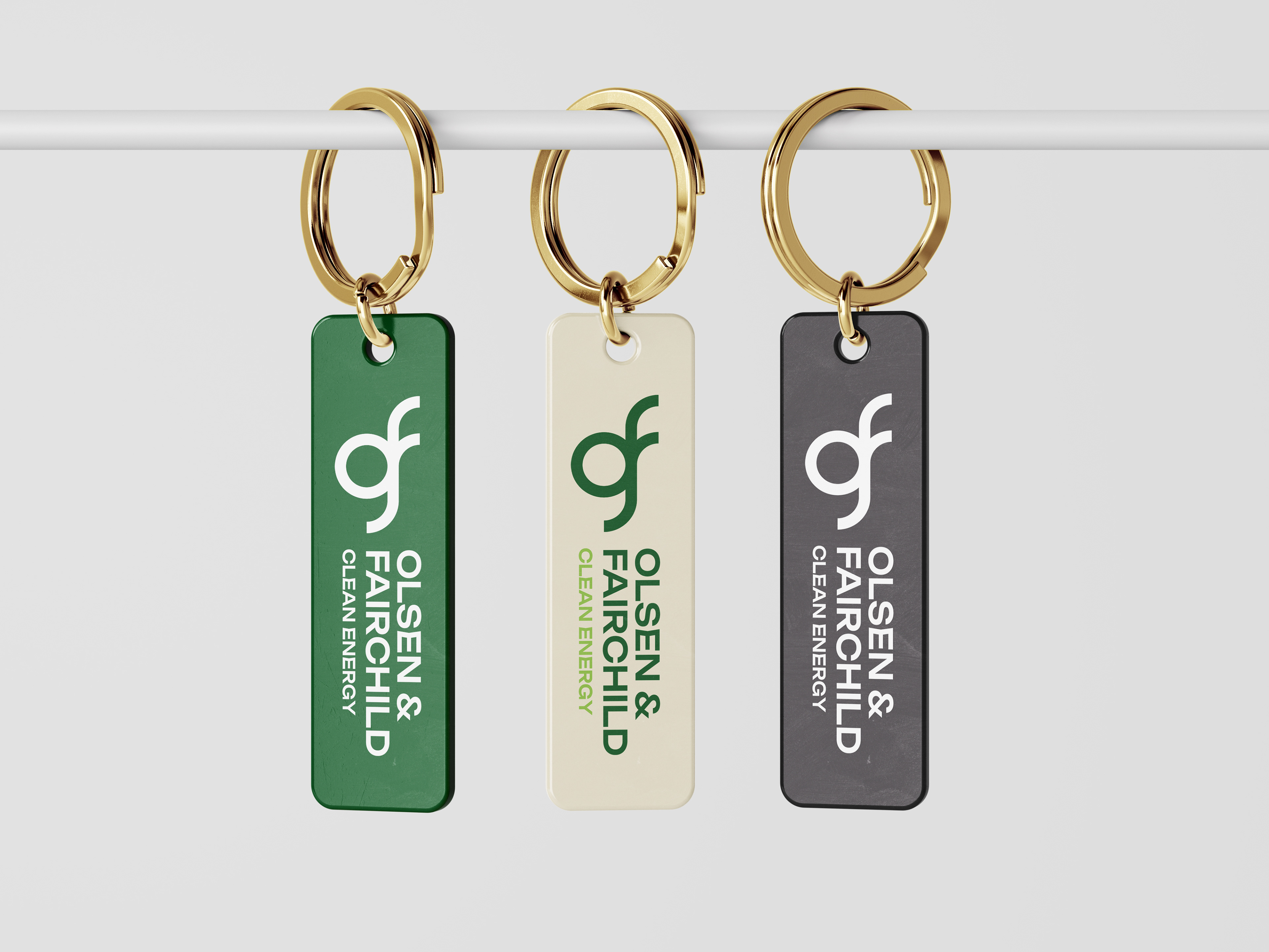
Keychain mockup.

Mug mockup.
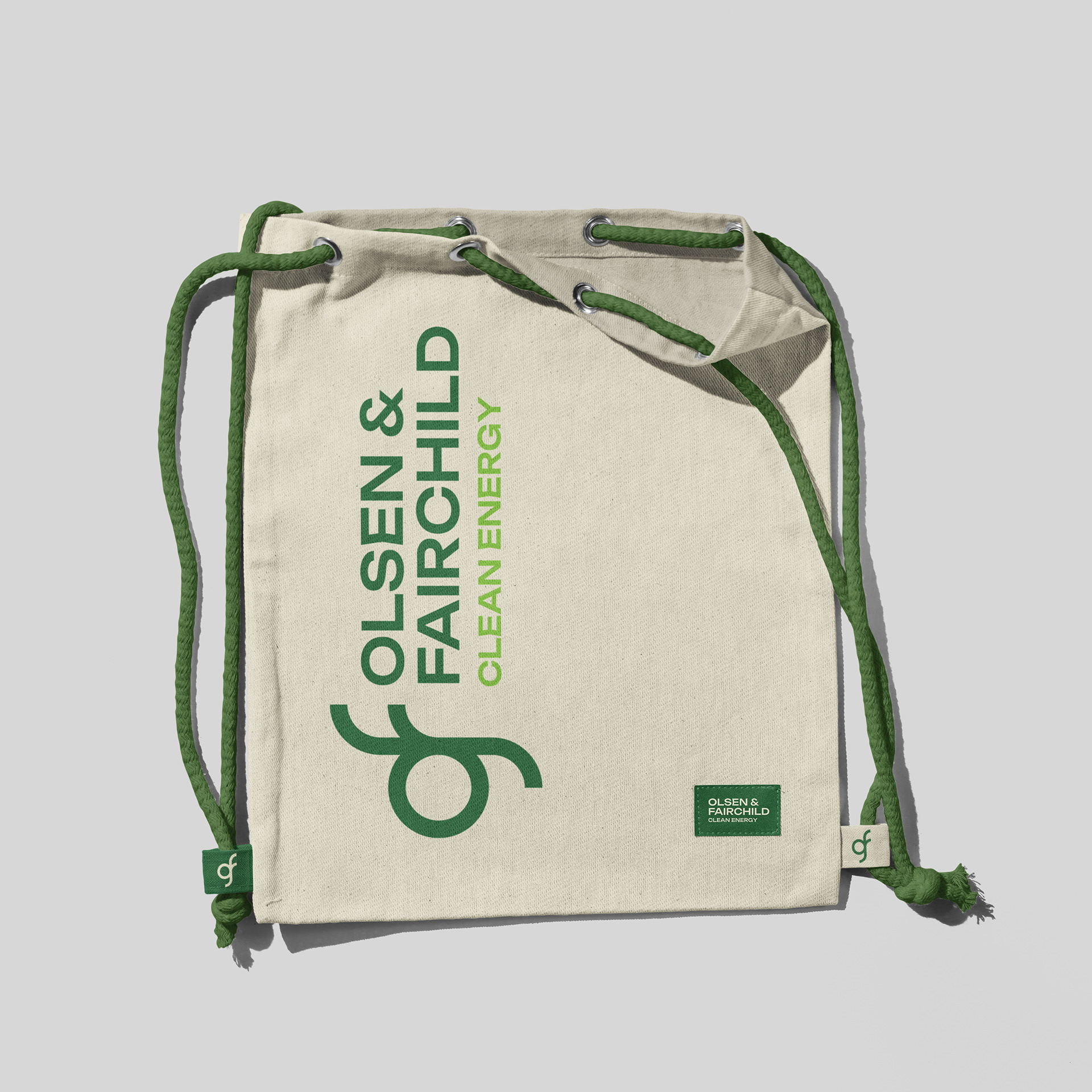
Bag mockup.
Process

Moodboards of logos for different businesses.
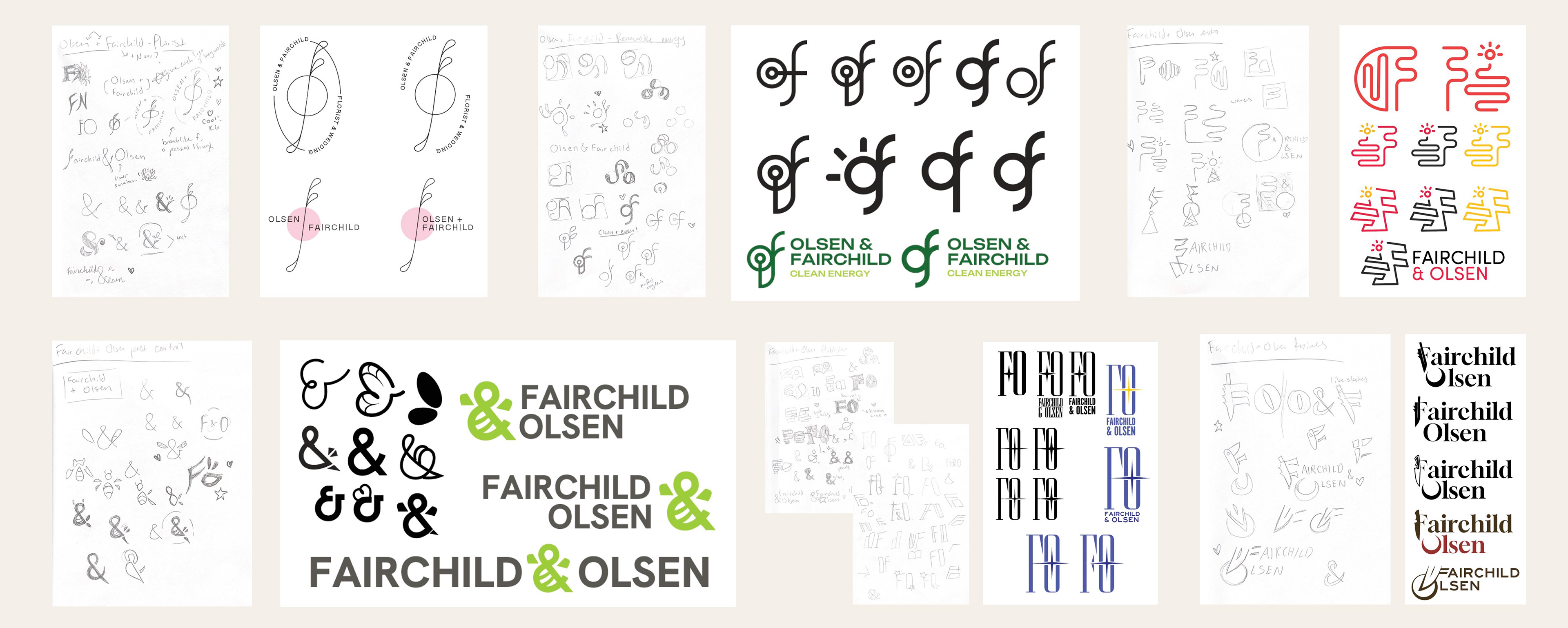
Sketches and first drafts.

Second round of drafts.

FINAL LOGOTYPES
After rigorous drafting, I had six completed logotypes. To narrow them down to one, my peers evaluated them based on how well they conveyed their business. The clean energy logo won for its creative use of the "F" as a tree, along with the clean feel of its colors accompanying typeface.