
The Ask:
Create a set of twelve icons representing American botanical gardens.
The Answer:
An icon set inspired by the unique aspects of each garden represented, stylized with sharp edges to stand out from traditional sets of natural icons.

Icon Poster.

Icon usage mockups.
Pin mockups.
Process
Garden Research & Moodboard
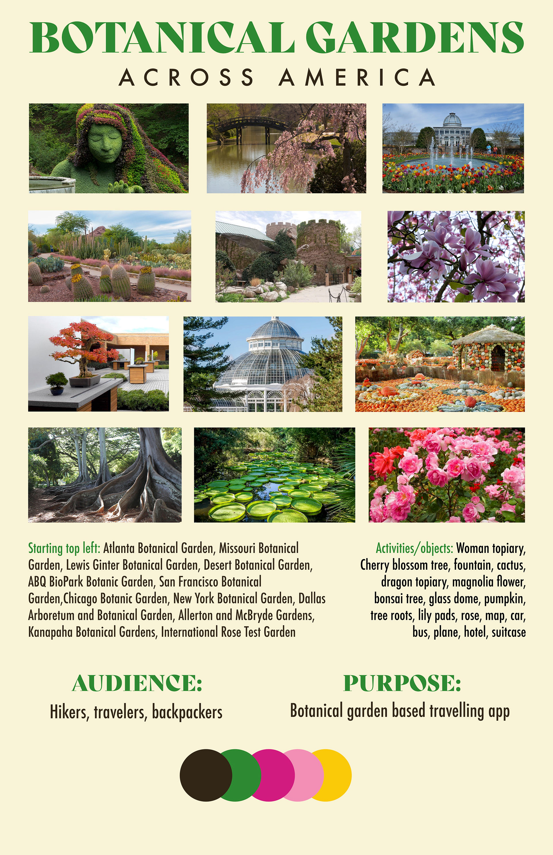
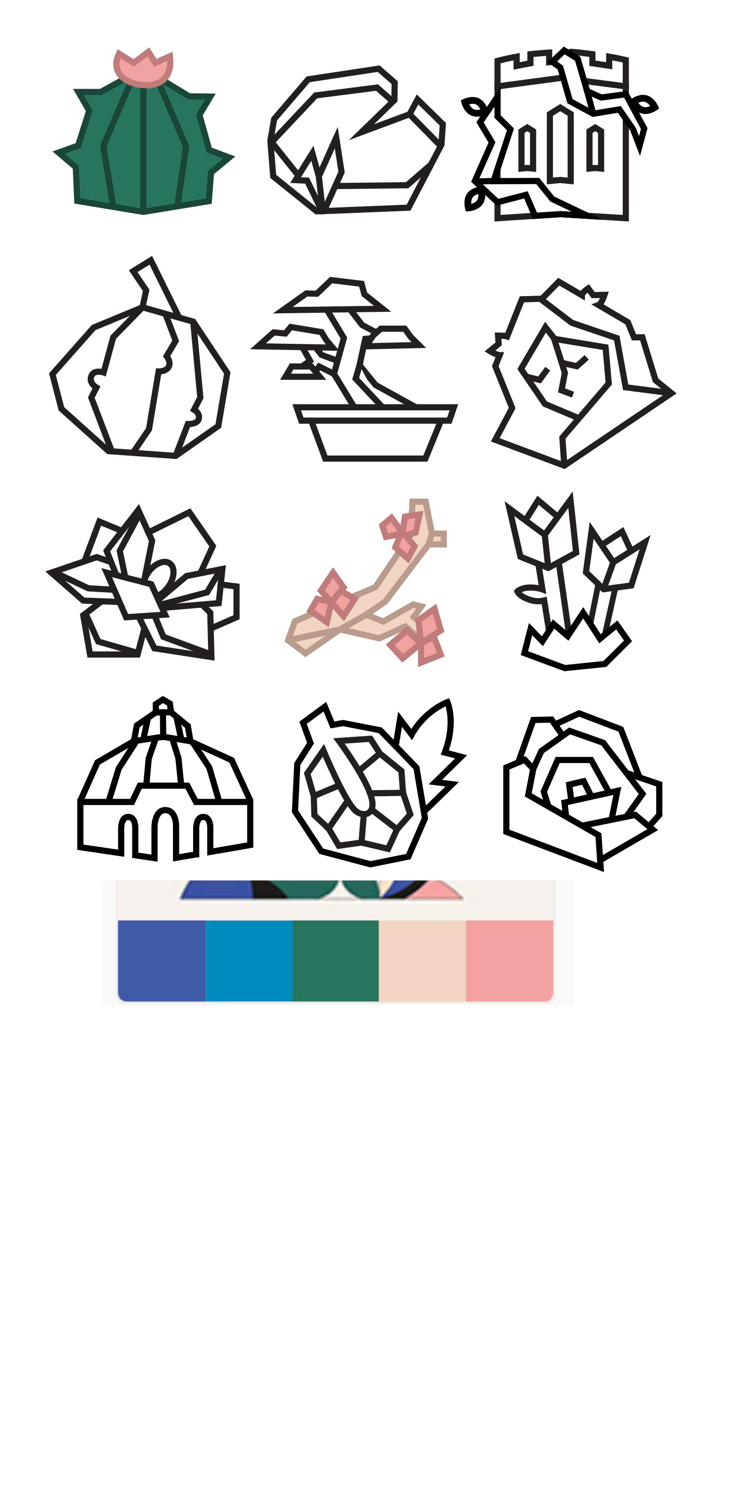
To begin, I identified twelve gardens I wanted to represent in my icon set. Each garden had a unique aspect that drew attendees, such as the Atlanta Botanical Garden's woman topiary.
I identified common colors used in the gardens' advertising and compiled them into a moodboard with initial ideas for how to represent the icons.
First Drafts
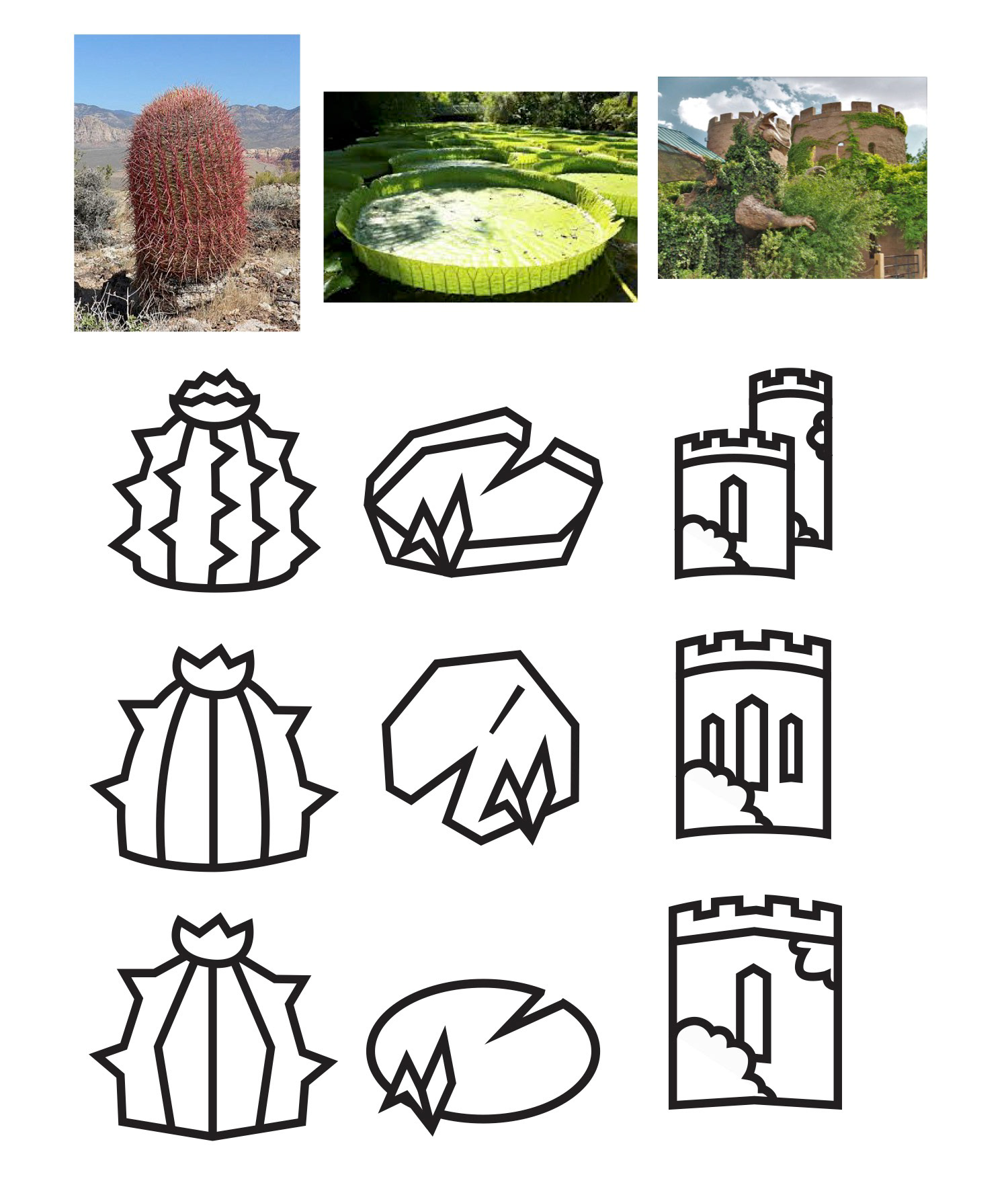
From the start, I knew I wanted to stylize the icons with sharp edges to stand out from most botanical icons online. It took a while to translate complicated photographs to simple icons, but through a few rounds of peer reviews I managed to refine my first few icons to ones that I liked.
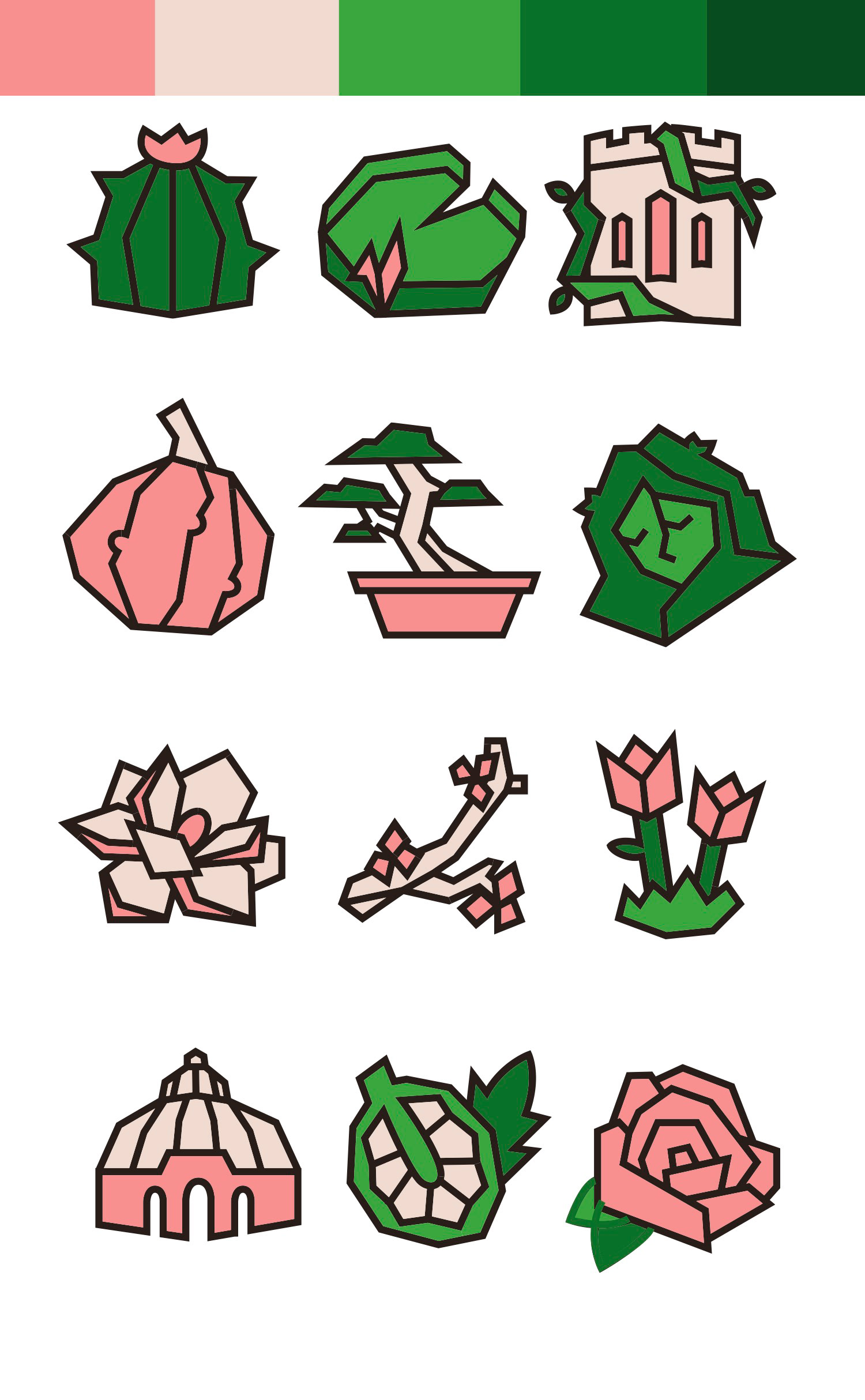

Color Drafts
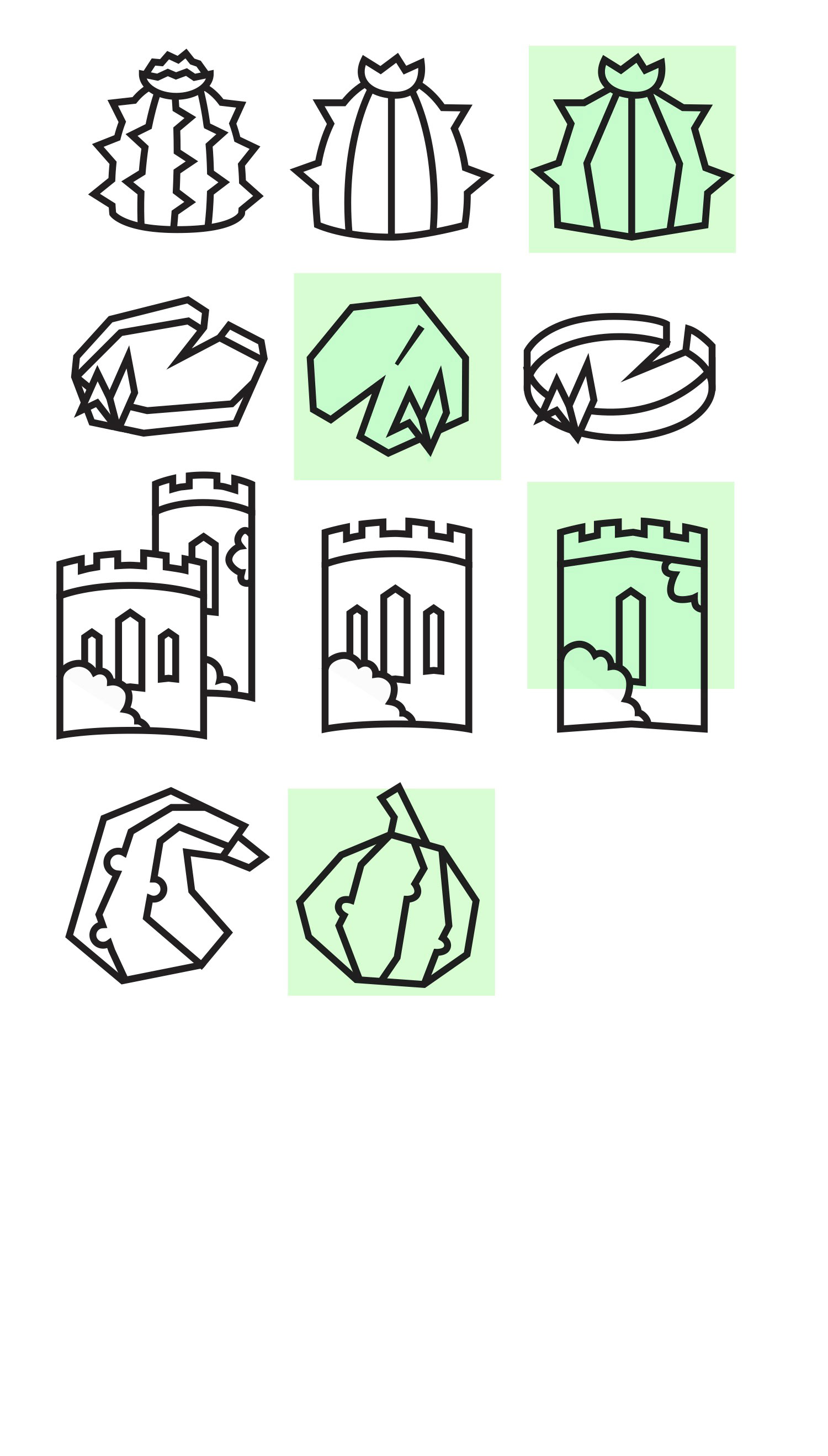
After finishing the Icons, I had to color them and was limited to four colors by the assignment. I deviated from the initial colors in my moodboard, opting for more muted colors to keep the color from being too distracting. I settled on a coral pink as an accent color, since it could be used both in flowers and as a substitute for orange, like on the squash and bonsai pot, and I opted for a dark brown as an outline color.